4. Ein Schneller Einstieg
Section author: jolly-jump
Note
Zuletzt aktualisiert: January 26, 2018 at 22:40 CET
Der Quellcode für dieses Kapitel befindet sich im assets Verzeichnis.
Dieses Kapitel gibt einen Überblick über QML, die Beschreibungssprache für das Benutzerinterface in Qt 5. Wir diskutieren die QML Syntax, die aus einer baumartigen Struktur von Elementen besteht und es folgt ein Überblick über die wichtigsten Grundelemente. Später schauen wir uns kurz an, wie man eigene Elemente erstellt, so genannte “components” und wie man Elemente verändert mit Hilfe von Manipulationen von Eigenschaften. Zum Schluss behandeln wir Layouts, die Elemente arrangieren können und in welche Elemente der Benutzer Eingaben machen kann.
4.1. QML Syntax
QML ist eine Auszeichnungs- oder Beschreibungssprache mit deren Hilfe das Benutzerinterface deiner Anwendung beschrieben wird. Das Benutzerinterface wird durch kleine Elemente beschrieben, die in größere Komponenten zusammengefasst werden. QML beschreibt dabei das Aussehen und das Verhalten der Interfaceelemente. Das Benutzerinterface kann dann mit Hilfe von JavaScript Code erweitert werden um einfache oder komplexe Programmlogik hinzuzufügen. Diese Art und Weise folgt dem HTML-JavaScript Muster, aber QML ist im Gegensatz zu HTML von Grund auf darauf ausgelegt, Benutzerschnittstellen statt Text-Dokumente zu beschreiben.
In ihrer einfachsten Form ist QML eine Hierarchie von
Elementen. Kinder-Elemente erben das Koordinatensystem von ihren
Eltern. Eine x,y Koordinate ist immer relativ zum Elternelement.
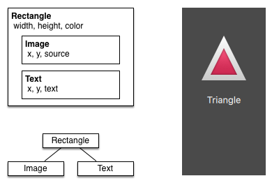
Beginnen wir mit einem einfachen Beispiel einer QML-Datei um die zu HTML unterschiedliche Syntax zu erklären:
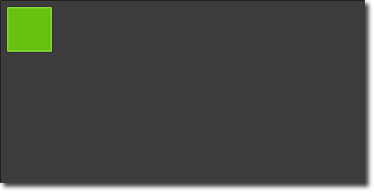
// RectangleExample.qml

import QtQuick 2.5

// The root element is the Rectangle
Rectangle {
    // name this element root
    id: root

    // properties: <name>: <value>
    width: 120; height: 240

    // color property
    color: "#4A4A4A"

    // Declare a nested element (child of root)
    Image {
        id: triangle

        // reference the parent
        x: (parent.width - width)/2; y: 40

        source: 'assets/triangle_red.png'
    }

    // Another child of root
    Text {
        // un-named element

        // reference element by id
        y: triangle.y + triangle.height + 20

        // reference root element
        width: root.width

        color: 'white'
        horizontalAlignment: Text.AlignHCenter
        text: 'Triangle'
    }
}
- Der
importBefehl importiert ein Modul in einer speziellen Version. Grundsätzlich ist der Import von QtQuick 2.0 ein guter Start. - Einzeilige Kommentare kann man mit Hilfe von
//oder mehrzeilige mit Hilfe von/* */eingeben, genau wir in C/C++ und JavaScript - Jede QML-Datei benötigt genau ein Wurzelelement wie in HTML (hier: “Rectangle”)
- Ein Element wird über sein Typ gefolgt von
{ }definiert. - Elemente können Eigenschaften haben, die in der Form
name : valuegeschrieben werden. - Beliebige Elemente innerhalb eines QML-Dokuments können über ihre
id(ein Bezeichner ohne Anführungszeichen) angesprochen werden. - Elemente können verschachtelt werden, was dann bedeutet, dass ein Elternelement Kindelemente hat. Die Elternelemente kann man über das Schlüsselword
parentansprechen
Tip
Often you want to access a particular element by id or a parent element using the parent keyword. So it’s good practice to name your root element “root” using id: root. Then you don’t have to think about how the root element is named in your QML document.
Hint
Jetzt kann man das Beispiel mit der Qt Quick runtime von der Kommandozeile starten
    $ $QTDIR/<version>/<target>/bin/qmlscene RectangleExample.qml

wobei du *$QTDIR* durch den Pfad zu deiner Qt installation ersetzen musst, *<version* durch die Version von Qt und *<target>* z.B durch *gcc_64*. Die *qmlscene* Date initialisiert die Runtim und interpretiert die angegebene QML Datei

In Qt Creator kannst du das ensprechende Projekt öffnen und das Dokument ``RectangleExample.qml`` ausführen.
4.1.1. Eigenschaften
Elemente werden über deren Elementname deklariert, aber erst die Benutzung der Eigenschaften oder durch selbst erstellte Eigenschaften sind Elemente richtig definiert. Eine Eigenschaft ist eine einfaches Schlüssel-Wert Paar, z.B.
width : 100
text: 'Hallo'
color: '#FF0000'
Eine Eigenschaft hat einen wohldefinierten Datentyp und kann einen Initialwert zugewiesen bekommen (Im Beispiel jeweils die rechte Seite).
    Text {
        // (1) identifier
        id: thisLabel

        // (2) set x- and y-position
        x: 24; y: 16

        // (3) bind height to 2 * width
        height: 2 * width

        // (4) custom property
        property int times: 24

        // (5) property alias
        property alias anotherTimes: thisLabel.times

        // (6) set text appended by value
        text: "Greetings " + times

        // (7) font is a grouped property
        font.family: "Ubuntu"
        font.pixelSize: 24

        // (8) KeyNavigation is an attached property
        KeyNavigation.tab: otherLabel

        // (9) signal handler for property changes
        onHeightChanged: console.log('height:', height)

        // focus is need to receive key events
        focus: true

        // change color based on focus value
        color: focus?"red":"black"
    }
Schauen wir uns die verschiedenen Eigenheiten von Eigenschaften an:
idist ein sehr spezieller Wert mit dem man innerhalb einer QML-Datei (“document”) genau ein Element ansteuern (“referenzieren”) kann. Dieidist nicht vom Typ einer Zeichenkette sondern ein Bezeichner und Teil der QML Syntax. Eineidmuss einmalig in einem Dokument sein und ihm kann nicht ein anderer Wert zugewiesen werden, noch kann nach ihm gesucht werden. (Es benimmt sich eher wie ein Zeiger aus der C++-Welt).Eine Eigenschaft kann auf einen Wert gesetzt werden, abhängig von seinem Datentyp. Wenn kein Wert für eine Eigenschaft vergeben wurde, wird vom System ein erstmaliger Wert gewählt. Man muss die Dokumentation des jeweiligen Elements anschauen um diesen Initialwert herauszubekommen.
Eine Eigenschaft kann von einer oder vielen anderen Eigenschaften abhängen. Das nennt man binding (“Bindung”). Eine gebundene Eigenschaft wird immer aktualisiert wenn sich die andere Eigenschaft (von der der Wert abhängt) ändert. Man kann es sich wie einen Vertrag vorstellen, in diesem Beispiel ist die Höhe
heightimmer zwei mal der Breitewidth.Eigene Eigenschaft kann man zu einem Element hinzufügen in dem man den Bezeichner
propertygefolgt von dem Datentyp, dem Namen der Eigenschaft und - wenn man will - einem initialen Wert verwendet (property <type> <name> : <value>). Falls kein Wert angegeben wird, wählt das System einen.Note
You can also declare one property to be the default property if no property name is given by prepending the property declaration with the
defaultkeyword. This is used for example when you add child elements, the child elements are added automatically to the default propertychildrenof type list if they are visible elements.Eine weitere Möglichkeit, Eigenschaften zu definieren ist über das Schlüsselwort
alias(property alias <name> : <reference>). DasaliasSchlüsselwort erlaubt uns eine Eigenschaft eines anderen Elements oder ein Element selbst weiterzuleiten, d.h. hier verwendbar zu machen. Wir werden diese Technik später nutzen, wenn wir Komponenten definiteren, die innere Eigenschaften besitzen, die wir aber im Wurzelelement verwenden wollen. Einproperty aliasbraucht keinen Typ, denn es verwendet den Typ der Referenzeigenschaft oder des Referenzelements.Die
text-Eigenschaft hängt hier von der erfundenen Eigenschafttimesab, welche vom Typint(Ganzzahl) ist. Derint-Wert wird dann automatisch in einenstring-Typ konvertiert. Der Ausdruck ist ein Beispiel einer Bindung und hat zur Folge, dass immer automatisch wenntimessich ändert, der Text geändert wird.Einige Eigenschaften können gruppiert werden. Dieses Feature wird verwendet, wenn eine Eigenschaft strukturiert werden soll und verwandte Eigenschaften gruppiert werden sollen. Gruppen von Eigenschaften kann man auch so schreiben:
font { family: "Ubuntu"; pixelSize: 24 }.Einige Eigenschaften sind an ein Element geheftetet. Das macht man für globale Elemente, die nur einmalig in der Applikation vorkommen (z.B: Tastatureingaben). Die Syntax dazu ist
<Element>.<property>: <value>.Für jede Eigenschaft kann man signal handler zur Verfügung stellen. Diese Funktion wird dann aufgerufen, sobald die Eigenschaft sich ändert. Hier beispielsweise wird man über die eingebaute Funktion
console.logimmer dann informiert, wenn sich de Höhe ändert.
Warning
Eine Element-ID sollte man nur innerhalb seines Dokuments (also der aktuellen Datei) verwenden. QML erlaubt zwar mit dem Mechanismus “dynamic-scoping”, dass später geladene Dokumente die IDs von früher geladenen Dokumenten überschreiben und entspricht so etwas wie globalen Variablen. Leider führt das häufig zu sehr schlecht funktionierendem Code, bei dem der Ausgang von der Reihenfolge der Ausführung abhängt. Daher sollte man eine ID von außerhalb nicht direkt verwenden, sondern besser ein Element, dass man nach außen exporieren will über Eigenschaften des Wurzelelements des aktuellen Dokuments zur Verfügung stellen.
4.1.2. Scripting
QML and JavaScript (also known as ECMAScript) are best friends. In the JavaScript chapter we will go into more detail on this symbiosis. Currently we just want to make you aware about this relationship.
    Text {
        id: label

        x: 24; y: 24

        // custom counter property for space presses
        property int spacePresses: 0

        text: "Space pressed: " + spacePresses + " times"

        // (1) handler for text changes
        onTextChanged: console.log("text changed to:", text)

        // need focus to receive key events
        focus: true

        // (2) handler with some JS
        Keys.onSpacePressed: {
            increment()
        }

        // clear the text on escape
        Keys.onEscapePressed: {
            label.text = ''
        }

        // (3) a JS function
        function increment() {
            spacePresses = spacePresses + 1
        }
    }
- The text changed handler
onTextChangedprints the current text every-time the text changed due to a space-bar key pressed - When the text element receives the space-bar key (because the user pressed the space-bar on the keyboard) we call a JavaScript function
increment(). - Definition of a JavaScript function in the form of
function <name>(<parameters>) { ... }, which increments our counterspacePressed. Every timespacePressedis incremented, bound properties will also be updated.
Note
The difference between the QML : (binding) and the JavaScript = (assignment) is, that the binding is a contract and keeps true over the lifetime of the binding, whereas the JavaScript assignment (=) is a one time value assignment.
The lifetime of a binding ends, when a new binding is set to the property or even when a JavaScript value is assigned is to the property. For example a key handler setting the text property to an empty string would destroy our increment display:
Keys.onEscapePressed: {
    label.text = ''
}
After pressing escape, pressing the space-bar will not update the display anymore as the previous binding of the text property (text: “Space pressed: ” + spacePresses + ” times”) was destroyed.
When you have conflicting strategies to change a property as in this case (text updated by a change to a property increment via a binding and text cleared by a JavaScript assignment) then you can’t use bindings! You need to use assignment on both property change paths as the binding will be destroyed by the assignment (broken contract!).
4.2. Basiselemente
Elemente kann man in visuelle und nicht-visuelle Elemente
gruppieren. Ein visuelles Elemente (wie z.B. Rectangle) hat eine
Geometrie und wird üblicherweise auf einem Gebiet des Bildschirms
angezeigt. Ein nicht-visuelles Elemente (wie z.B. ein Timer)
bringt allgemeine Funktionalität mit sich, die man oft verwendet um
die visuellen Elemente zu manipulieren.
Wir fokussieren uns hier mal auf die fundamentalen visuellen Elemente,
wie Item, Rectangle, Text, Image und MouseArea.
4.2.1. Das Item Element
Item ist das Basiselement für alle visuellen Elemente weil alle
anderen visuellen Elemente von ihm abstammen. Es zeichnet zunächst
nichts selbst auf den Schirm, aber es definiert Eigenschaften, die für
alle visuellen Elemente gelten:
| Gruppe | Eigenschaften |
|---|---|
| Geometrie | x und y definieren die Position oben-links,
width und height stehen für die Ausmaße des Elements
und z beschreibt wie die Elemente gestapelt werden und
welches vor anderen angezeigt wird. |
| Layout | anchors (left, right, top, bottom, vertical und
horizontal center) werden verwendet um die Elemente relativ
zu anderen Elementen mit deren jeweiligen Rändern
(margins) zu positionieren |
| Tastatur | Die angehefteten Key und KeyNavigation Eigenschaften
verwalten die Tasten und die Eingabeeigenschaft focus
macht die Tastenverwendung überhaupt erst möglich. |
| Transformationen | scale und rotate transformieren wie der Name es
sagt, generell ist die transform-Eigenschaftenliste für
x,y,z beliebige Transformation um deren
transformOrigin Punkt zuständig |
| Sichtbarkeit | opacity verwaltet die Transparenz, visible um
Elemente anzuzeigen/zu verbergen, clip um die
Zeichentätigkeit auf die Elementmaße einzugrenzen und
smooth um die Qualität der Darstellung zu verbessern |
| Zustandsdefinition | Die states-Eigenschaftenliste mit der unterstützten Liste
von Zuständen und dem aktuellen Zustand in der Eigenschaft
state, ebenso wie man Übergänge mit Hilfe der
Eigenschaftenliste transistions animieren kann. |
Um die verschiedenen Eigenschaften besser zu verstehen, werden wir sie im Zusammenhang mit einem Element genauer vorstellen. Merke dir, dass dieses Basiseigenschaften in jedem sichtbaren Element vorhanden sind und überall dort gleich funktionieren.
Note
Das Item-Element wird oft als Container für andere Elemente
verwendet, genau wie das div-Element in HTML.
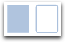
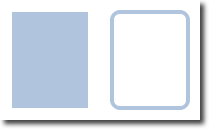
4.2.2. Das Rectangle Element
Das Rechteckelement Rectangle beerbt und erweitert das Item
Element und fügt eine Füllfarbe und Ränder hinzu über border.color
and border.width. Für abgerundete Ecken ist die radius
Eigenschaft zuständig.
    Rectangle {
        id: rect1
        x: 12; y: 12
        width: 76; height: 96
        color: "lightsteelblue"
    }
    Rectangle {
        id: rect2
        x: 112; y: 12
        width: 76; height: 96
        border.color: "lightsteelblue"
        border.width: 4
        radius: 8
    }
Note
Gültige Farbwerte sind Farben der SVG Farbnamen (siehe http://www.w3.org/TR/css3-color/#svg-color). Man kann Farben in QML auf verschiedene Weisen produzieren, der übliche Weg ist ein RGB-Farbwert (‘#FF4444’) oder über einen englischen Farbnamen (z.B. ‘white’).
Neben der Füllfarbe und einem Rand unterstützt ein Rechteck noch selbsterstellte Gradienten.
    Rectangle {
        id: rect1
        x: 12; y: 12
        width: 176; height: 96
        gradient: Gradient {
            GradientStop { position: 0.0; color: "lightsteelblue" }
            GradientStop { position: 1.0; color: "slategray" }
        }
        border.color: "slategray"
    }
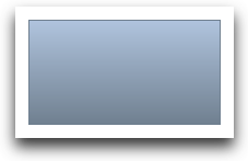
Ein Gradient wird über eine Folge von Gradientenmarken
GradientStop definiert. Jede Marke hat eine Position und eine
Farbe. Die Position legt die Marke auf der y-Achse fest (0=oben,
1=unten) und color die Farbe an dieser Position.
Note
Ein Rechteck mit keiner Höhe/Breite wird nicht sichrbar sein. Das kann oft dann passieren, wenn man mehrere Rechtecksbreiten (-höhen) von einander abhängig definiert hat und irgendetwas in der Logik des Zusammenbaus schief ging.
Note
Man kann keinen schrägen Gradienten erzeugen. Dann ist es besser, vordefinierte Bilder zu verwenden. Man könnte zwar die Rechtecke mit Gradient drehen, aber dann stimmt die Geometrie des gedrehten Rechtecks wird nicht geändert und wird daher zu Verwirrung führen, weil die Geometrie des Elements dann nicht mehr mit der Geometrie der sichtbaren Fläche zusammenpasst. Der Autor meint, es sei besser, vordesignte Gradientenbilder zu verwenden.
4.2.3. Text Element
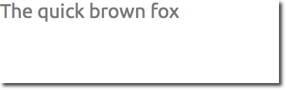
To display text, you can use the Text element. Its most notable property is the text property of type string. The element calculates its initial width and height based on the given text and the font used. The font can be influenced using the font property group (e.g. font.family, font.pixelSize, ...). To change the color of the text just use the color property.
    Text {
        text: "The quick brown fox"
        color: "#303030"
        font.family: "Ubuntu"
        font.pixelSize: 28
    }
Text can be aligned to each side and the center using the horizontalAlignment and verticalAlignment properties. To further enhance the text rendering you can use the style and styleColor property , which allows you render the text in outline, raised and sunken mode. For longer text you often want to define a break position like A very ... long text, this can be achieved using the elide property. The elide property allows you to set the elide position to the left, right or middle of your text. In case you don’t want the ‘...’ of the elide mode to appear but still want to see the full text you can also wrap the text using the wrapMode property (works only when width is explicitly set):
Text {
    width: 40; height: 120
    text: 'A very long text'
    // '...' shall appear in the middle
    elide: Text.ElideMiddle
    // red sunken text styling
    style: Text.Sunken
    styleColor: '#FF4444'
    // align text to the top
    verticalAlignment: Text.AlignTop
    // only sensible when no elide mode
    // wrapMode: Text.WordWrap
}
A Text element only displays the given text. It does not render any background decoration. Besides the rendered text the Text element is transparent. It’s part of your overall design to provide a sensible background to the text element.
Note
Be aware a Text initial width (height) is depending on the text string and on the font set. A Text element with no width set and no text will not be visible, as the initial width will be 0.
Note
Often when you want to layout Text elements you need to differentiate between aligning the text inside the Text element boundary box or to align the element boundary box itself. In the former you want to use the horizontalAlignment and verticalAlignment properties and in the later case you want to manipulate the element geometry or use anchors.
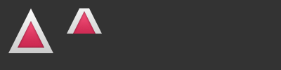
4.2.4. Image Element
An Image element is able to display images in various formats (e.g. PNG, JPG, GIF, BMP, WEBP). For the full list of supported image formats, please consult the Qt documentation. Besides the obvious source property to provide the image URL it contains a fillMode which controls the resizing behavior.
    Image {
        x: 12; y: 12
        // width: 72
        // height: 72
        source: "assets/triangle_red.png"
    }
    Image {
        x: 12+64+12; y: 12
        // width: 72
        height: 72/2
        source: "assets/triangle_red.png"
        fillMode: Image.PreserveAspectCrop
        clip: true
    }
Note
A URL can be a local path with forward slashes ( ”./images/home.png” ) or a web-link (e.g. “http://example.org/home.png”).
Note
Image elements using PreserveAspectCrop should also enable the clipping to avoid image data being rendered outside the Image boundaries. By default clipping is disabled (clip : false). You need to enable clipping (clip : true) to constrain the painting to the elements bounding rectangle. This can be used on any visual element.
Tip
Using C++ you are able to create your own image provider using QQmlImageProvider. This allows you to create images on the fly and threaded image loading.
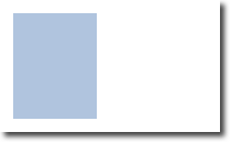
4.2.5. MouseArea Element
To interact with these elements you often will use a MouseArea. It’s a rectangular invisible item in where you can capture mouse events. The mouse area is often used together with a visible item to execute commands when the user interacts with the visual part.
    Rectangle {
        id: rect1
        x: 12; y: 12
        width: 76; height: 96
        color: "lightsteelblue"
        MouseArea {
            id: area
            width: parent.width
            height: parent.height
            onClicked: rect2.visible = !rect2.visible
        }
    }

    Rectangle {
        id: rect2
        x: 112; y: 12
        width: 76; height: 96
        border.color: "lightsteelblue"
        border.width: 4
        radius: 8
    }
|
|
Note
This is an important aspect of Qt Quick, the input handling is separated from the visual presentation. By this it allows you to show the user an interface element, but the interaction area can be larger.
4.3. Components
A component is a reusable element and QML provides different ways to create components. Currently we will look only at the simplest form - a file based component. A file based component is created by placing a QML element in a file and give the file an element name (e.g. Button.qml). You can use the component like every other element from the QtQuick module, in our case you would use this in your code as Button { ... }.
For example, let’s create a rectangle containing a text componenet and a mouse area. This resembles a simple button and doesn’t need to be more complicated for our purposes.
    Rectangle { // our inlined button ui
        id: button
        x: 12; y: 12
        width: 116; height: 26
        color: "lightsteelblue"
        border.color: "slategrey"
        Text {
            anchors.centerIn: parent
            text: "Start"
        }
        MouseArea {
            anchors.fill: parent
            onClicked: {
                status.text = "Button clicked!"
            }
        }
    }

    Text { // text changes when button was clicked
        id: status
        x: 12; y: 76
        width: 116; height: 26
        text: "waiting ..."
        horizontalAlignment: Text.AlignHCenter
    }
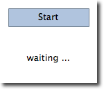
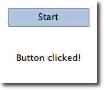
The UI will look similar to this. On the left the UI in the initial state, on the right after the button has been clicked.
|
|
Our task is now to extract the button UI in a reusable component. For this we shortly think about a possible API for our button. You can do this by imagining how someone else should use your button. Here’s what I came up with:
// minimal API for a button
Button {
    text: "Click Me"
    onClicked: { // do something }
}
I would like to set the text using a text property and to implement my own click handler. Also I would expect the button to have a sensible initial size, which I can overwrite (e.g. with width: 240 for example).
To achieve this we create a Button.qml file and copy our button UI inside. Additionally we need to export the properties a user might want to change on the root level.
// Button.qml

import QtQuick 2.5

Rectangle {
    id: root
    // export button properties
    property alias text: label.text
    signal clicked

    width: 116; height: 26
    color: "lightsteelblue"
    border.color: "slategrey"

    Text {
        id: label
        anchors.centerIn: parent
        text: "Start"
    }
    MouseArea {
        anchors.fill: parent
        onClicked: {
            root.clicked()
        }
    }
}
We have exported the text and clicked signal on the root level. Typically we name our root element root to make the referencing easier. We use the alias feature of QML, which is a way to export properties inside nested QML elements to the root level and make this available for the outside world. It is important to know, that only the root level properties can be accessed from outside this file by other components.
To use our new Button element we can simply declare it in our file. So the earlier example will become a little bit simplified.
    Button { // our Button component
        id: button
        x: 12; y: 12
        text: "Start"
        onClicked: {
            status.text = "Button clicked!"
        }
    }

    Text { // text changes when button was clicked
        id: status
        x: 12; y: 76
        width: 116; height: 26
        text: "waiting ..."
        horizontalAlignment: Text.AlignHCenter
    }
Now you can use as many buttons as you like in your UI by just using Button { ... }. A real button could be more complex, e.g providing feedback when clicked or showing a nicer decoration.
Note
Personally you could even go a step further and use an item as a root element. This prevents users to change the color of our designed button, and provides us more control about the exported API. The target should be to export a minimal API. Practically this means we would need to replace the root Rectangle with an Item and make the rectangle a nested element in the root item.
Item {
    id: root
    width: 116; height: 26

    property alias text: label.text
    signal clicked

    Rectangle {
        anchors.fill parent
        color: "lightsteelblue"
        border.color: "slategrey"
    }
    ...
}
With this technique, it is easy to create a whole series of reusable components.
4.4. Simple Transformations
A transformation manipulates the geometry of an object. QML Items can in general be translated, rotated and scaled. There is a simple form of these operations and a more advanced way.
Let’s start with the simple transformations. Here is our scene as our starting point.
A simple translation is done via changing the x,y position. A rotation is done using the rotation property. The value is provided in degrees (0 .. 360). A scaling is done using the scale property and a value <1 means the element is scaled down and >1 means the element is scaled up. The rotation and scaling does not change your geometry. The items x,y and width/height haven’t changed. Just the painting instructions are transformed.
Before we show off the example I would like to introduce a little helper: The ClickableImage element. The ClickableImage is just an image with a mouse area. This brings up a useful rule of thumb - if you have copied a chunk of code three times, extract it into a component.
// ClickableImage.qml

// Simple image which can be clicked

import QtQuick 2.5

Image {
    id: root
    signal clicked

    MouseArea {
        anchors.fill: parent
        onClicked: root.clicked()
    }
}
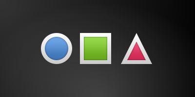
We use our clickable image to present three objects (box, circle, triangle). Each object performs a simple transformation when clicked. Clicking the background will reset the scene.
// transformation.qml


import QtQuick 2.5

Item {
    // set width based on given background
    width: bg.width
    height: bg.height

    Image { // nice background image
        id: bg
        source: "assets/background.png"
    }

    MouseArea {
        id: backgroundClicker
        // needs to be before the images as order matters
        // otherwise this mousearea would be before the other elements
        // and consume the mouse events
        anchors.fill: parent
        onClicked: {
            // reset our little scene
            circle.x = 84
            box.rotation = 0
            triangle.rotation = 0
            triangle.scale = 1.0
        }
    }

    ClickableImage {
        id: circle
        x: 84; y: 68
        source: "assets/circle_blue.png"
        antialiasing: true
        onClicked: {
            // increase the x-position on click
            x += 20
        }
    }

    ClickableImage {
        id: box
        x: 164; y: 68
        source: "assets/box_green.png"
        antialiasing: true
        onClicked: {
            // increase the rotation on click
            rotation += 15
        }
    }

    ClickableImage {
        id: triangle
        x: 248; y: 68
        source: "assets/triangle_red.png"
        antialiasing: true
        onClicked: {
            // several transformations
            rotation += 15
            scale += 0.05
        }
    }

    function _test_transformed() {
        circle.x += 20
        box.rotation = 15
        triangle.scale = 1.2
        triangle.rotation = -15
    }

    function _test_overlap() {
        circle.x += 40
        box.rotation = 15
        triangle.scale = 2.0
        triangle.rotation = 45
    }

}
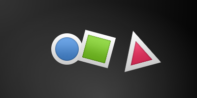
The circle increments the x-position on each click and the box will rotate on each click. The triangle will rotate and scale the image down on each click, to demonstrate a combined transformation. For the scaling and rotation operation we set antialiasing: true to enable anti-aliasing, which is switched off (same as the clipping property clip) for performance reasons. In your own work, when you see some rasterized edges in your graphics, then you should probably switch smooth on.
Note
To achieve better visual quality when scaling images it is recommended to scale images down instead of up. Scaling an image up with a larger scaling factor will result into scaling artifacts (blurred image). When scaling an image you should consider using antialiasing : true to enable the usage of a higher quality filter.
The background MouseArea covers the whole background and resets the object values.
Note
Elements which appear earlier in the code have a lower stacking order (called z-order). If you click long enough on circle you will see it moves below box. The z-order can also be manipulated by the z-property of an Item.

This is because box appears later in the code. The same applies also to mouse areas. A mouse area later in the code will overlap (and thus grab the mouse events) of a mouse area earlier in the code.
Please remember: The order of elements in the document matters.
4.5. Positioning Elements
There are a number of QML elements used to position items. These are called positioners and the following are provided in the QtQuick module Row, Column, Grid and Flow. They can be seen showing the same contents in the illustration below.
Note
Before we go into details, let me introduce some helper elements. The red, blue, green, lighter and darker squares. Each of these components contains a 48x48 pixels colorized rectangle. As reference here is the source code for the RedSquare:
// RedSquare.qml

import QtQuick 2.5

Rectangle {
    width: 48
    height: 48
    color: "#ea7025"
    border.color: Qt.lighter(color)
}
Please note the use of Qt.lighter(color) to produce a lighter border color based on the fill color. We will use these helpers in the next examples to make the source code more compact and hopefully readable. Please remember, each rectangle is initial 48x48 pixels.
The Column element arranges child items into a column by stacking them on top of each other. The spacing property can be used to distance each of the child elements from each other.
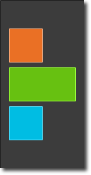
// column.qml

import QtQuick 2.5

DarkSquare {
    id: root
    width: 120
    height: 240

    Column {
        id: row
        anchors.centerIn: parent
        spacing: 8
        RedSquare { }
        GreenSquare { width: 96 }
        BlueSquare { }
    }
}
The Row element places its child items next to each other, either from the left to the right, or from the right to the left, depending on the layoutDirection property. Again, spacing is used to separate child items.
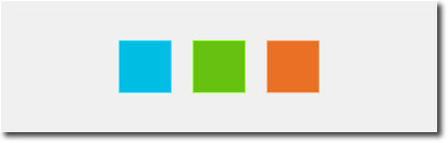
// row.qml

import QtQuick 2.5

BrightSquare {
    id: root
    width: 400; height: 120

    Row {
        id: row
        anchors.centerIn: parent
        spacing: 20
        BlueSquare { }
        GreenSquare { }
        RedSquare { }
    }
}
The Grid element arranges its children in a grid, by setting the rows and columns properties, the number or rows or columns can be constrained. By not setting either of them, the other is calculated from the number of child items. For instance, setting rows to 3 and adding 6 child items will result in 2 columns. The properties flow and layoutDirection are used to control the order in which the items are added to the grid, while spacing controls the amount of space separating the child items.

// grid.qml

import QtQuick 2.5

BrightSquare {
    id: root
    width: 160
    height: 160

    Grid {
        id: grid
        rows: 2
        columns: 2
        anchors.centerIn: parent
        spacing: 8
        RedSquare { }
        RedSquare { }
        RedSquare { }
        RedSquare { }
    }

}
The final positioner is Flow. It adds its child items in a flow. The direction of the flow is controlled using flow and layoutDirection. It can run sideways or from the top to the bottom. It can also run from left to right or in the opposite direction. As the items are added in the flow, they are wrapped to form new rows or columns as needed. In order for a flow to work, it must have a width or a height. This can be set either directly, or though anchor layouts.

// flow.qml

import QtQuick 2.5

BrightSquare {
    id: root
    width: 160
    height: 160

    Flow {
        anchors.fill: parent
        anchors.margins: 20
        spacing: 20
        RedSquare { }
        BlueSquare { }
        GreenSquare { }
    }
}
An element often used with positioners is the Repeater. It works like a for-loop and iterates over a model. In the simplest case a model is just a value providing the amount of loops.
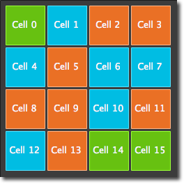
// repeater.qml

import QtQuick 2.5

DarkSquare {
    id: root
    width: 252
    height: 252
    property variant colorArray: ["#00bde3", "#67c111", "#ea7025"]


    Grid{
        anchors.fill: parent
        anchors.margins: 8
        spacing: 4
        Repeater {
            model: 16
            Rectangle {
                width: 56; height: 56
                property int colorIndex: Math.floor(Math.random()*3)
                color: root.colorArray[colorIndex]
                border.color: Qt.lighter(color)
                Text {
                    anchors.centerIn: parent
                    color: "#f0f0f0"
                    text: "Cell " + index
                }
            }
        }
    }
}
In this repeater example, we use some new magic. We define our own color property, which we use as an array of colors. The repeater creates a series of rectangles (16, as defined by the model). For each loop he creates the rectangle as defined by the child of the repeater. In the rectangle we chose the color by using JS math functions Math.floor(Math.random()*3). This gives us a random number in the range from 0..2, which we use to select the color from our color array. As noted earlier, JavaScript is a core part of Qt Quick, as such the standard libraries are available for us.
A repeater injects the index property into the repeater. It contains the current loop-index. (0,1,..15). We can use this to make our own decisions based on the index, or in our case to visualize the current index with the Text element.
Note
More advanced handling of larger models and kinetic views with dynamic delegates is covered in an own model-view chapter. Repeaters are best used when having a small amount of static data to be presented.
4.6. Layout Items
Todo
do we need to remove all uses of anchors earlier?
QML provides a flexible way to layout items using anchors. The concept of anchoring is part of the Item fundamental properties and available to all visual QML elements. An anchors acts like a contract and is stronger than competing geometry changes. Anchors are expressions of relativeness, you always need a related element to anchor with.
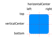
An element has 6 major anchor lines (top, bottom, left, right, horizontalCenter, verticalCenter). Additional there is the baseline anchor for text in Text elements. Each anchor line comes with an offset. In the case of top, bottom, left and right they are called margins. For horizontalCenter, verticalCenter and baseline they are called offsets.
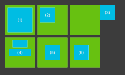
An element fills a parent element
        GreenSquare {
            BlueSquare {
                width: 12
                anchors.fill: parent
                anchors.margins: 8
                text: '(1)'
            }
        }
An element is left aligned to the parent
        GreenSquare {
            BlueSquare {
                width: 48
                y: 8
                anchors.left: parent.left
                anchors.leftMargin: 8
                text: '(2)'
            }
        }
An element left side is aligned to the parents right side
        GreenSquare {
            BlueSquare {
                width: 48
                anchors.left: parent.right
                text: '(3)'
            }
        }
Center aligned elements.
Blue1is horizontal centered on the parent.Blue2is also horizontal centered but onBlue1and it’s top is aligned to theBlue1bottom line.GreenSquare { BlueSquare { id: blue1 width: 48; height: 24 y: 8 anchors.horizontalCenter: parent.horizontalCenter } BlueSquare { id: blue2 width: 72; height: 24 anchors.top: blue1.bottom anchors.topMargin: 4 anchors.horizontalCenter: blue1.horizontalCenter text: '(4)' } }
An element is centered on a parent element
        GreenSquare {
            BlueSquare {
                width: 48
                anchors.centerIn: parent
                text: '(5)'
            }
        }
An element is centered with an left-offset on a parent element using horizontal and vertical center lines
        GreenSquare {
            BlueSquare {
                width: 48
                anchors.horizontalCenter: parent.horizontalCenter
                anchors.horizontalCenterOffset: -12
                anchors.verticalCenter: parent.verticalCenter
                text: '(6)'
            }
        }
Note
Our squares have been enhanced to enable dragging. Try the example and drag around some squares. You will see that (1) can’t be dragged as it’s anchored on all sides, sure you can drag the parent of (1) as it’s not anchored at all. (2) can be vertically dragged as only the left side is anchored. Similar applies to (3). (4) can only be dragged vertically as both squares are horizontal centered. (5) is centered on the parent and as such can’t be dragged, similar applies to (7). Dragging an element means changing their x,y position. As anchoring is stronger than geometry changes such as x,y, dragging is restricted by the anchored lines. We will see this effect later when we discuss animations.
4.7. Input Elements
We have already used the MouseArea as a mouse input element. Next, we’ll focus on keyboard input. We start off with the text editing elements: TextInput and TextEdit.
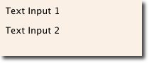
4.7.1. TextInput
The TextInput allows the user to enter a line of text. The element supports input constraints such as validator, inputMask, and echoMode.
// textinput.qml

import QtQuick 2.5

Rectangle {
    width: 200
    height: 80
    color: "linen"

    TextInput {
        id: input1
        x: 8; y: 8
        width: 96; height: 20
        focus: true
        text: "Text Input 1"
    }

    TextInput {
        id: input2
        x: 8; y: 36
        width: 96; height: 20
        text: "Text Input 2"
    }
}
The user can click inside a TextInput to change the focus. To support switching the focus by keyboard, we can use the KeyNavigation attached property.
// textinput2.qml

import QtQuick 2.5

Rectangle {
    width: 200
    height: 80
    color: "linen"

    TextInput {
        id: input1
        x: 8; y: 8
        width: 96; height: 20
        focus: true
        text: "Text Input 1"
        KeyNavigation.tab: input2
    }

    TextInput {
        id: input2
        x: 8; y: 36
        width: 96; height: 20
        text: "Text Input 2"
        KeyNavigation.tab: input1
    }
}
The KeyNavigation attached property supports a preset of navigation keys where an element id is bound to switch focus on the given key press.
A text input element comes with no visual presentation besides a blinking cursor and the entered text. For the user to be able to recognize the element as an input element it needs some visual decoration, for example a simple rectangle. When placing the TextInput inside an element you need make sure you export the major properties you want others be able to access.
We move this piece of code into our own component called TLineEditV1 for reuse.
// TLineEditV1.qml

import QtQuick 2.5

Rectangle {
    width: 96; height: input.height + 8
    color: "lightsteelblue"
    border.color: "gray"

    property alias text: input.text
    property alias input: input

    TextInput {
        id: input
        anchors.fill: parent
        anchors.margins: 4
        focus: true
    }
}
Note
If you want to export the TextInput completely, you can export the element by using property alias input: input. The first input is the property name, where the 2nd input is the element id.
We rewrite our KeyNavigation example with the new TLineEditV1 component.
Rectangle {
    ...
    TLineEditV1 {
        id: input1
        ...
    }
    TLineEditV1 {
        id: input2
        ...
    }
}
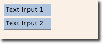
And try the tab key for navigation. You will experience the focus does not change to input2. The simple use of focus:true is not sufficient. The problem arises, that the focus was transferred to the input2 element the top-level item inside the TlineEditV1 (our Rectangle) received focus and did not forward the focus to the TextInput. To prevent this QML offers the FocusScope.
4.7.2. FocusScope
A focus scope declares that the last child element with focus:true receives the focus if the focus scope receives the focus. So it’s forward the focus to the last focus requesting child element. We will create a 2nd version of our TLineEdit component called TLineEditV2 using the focus scope as root element.
// TLineEditV2.qml

import QtQuick 2.5

FocusScope {
    width: 96; height: input.height + 8
    Rectangle {
        anchors.fill: parent
        color: "lightsteelblue"
        border.color: "gray"

    }

    property alias text: input.text
    property alias input: input

    TextInput {
        id: input
        anchors.fill: parent
        anchors.margins: 4
        focus: true
    }
}
Our example will now look like this:
Rectangle {
    ...
    TLineEditV2 {
        id: input1
        ...
    }
    TLineEditV2 {
        id: input2
        ...
    }
}
Pressing the tab key now successfully switches the focus between the 2 components and the correct child element inside the component is focused.
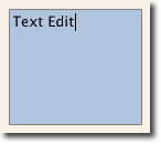
4.7.3. TextEdit
The TextEdit is very similar to TextInput and support a multi-line text edit field. It doesn’t have the text constraint properties as this depends on querying the painted size of the text (paintedHeight, paintedWidth). We also create our own component called TTextEdit to provide a edit background and use the focus scope for better focus forwarding.
// TTextEdit.qml

import QtQuick 2.5

FocusScope {
    width: 96; height: 96
    Rectangle {
        anchors.fill: parent
        color: "lightsteelblue"
        border.color: "gray"

    }

    property alias text: input.text
    property alias input: input

    TextEdit {
        id: input
        anchors.fill: parent
        anchors.margins: 4
        focus: true
    }
}
You can use it like the TLineEdit component
// textedit.qml

import QtQuick 2.5

Rectangle {
    width: 136
    height: 120
    color: "linen"

    TTextEdit {
        id: input
        x: 8; y: 8
        width: 120; height: 104
        focus: true
        text: "Text Edit"
    }
}
4.7.4. Keys Element
The attached property Keys allows executing code based on certain key presses. For example to move a square around and scale we can hook into the up, down, left and right keys to translate the element and the plus, minus key to scale the element.
// keys.qml

import QtQuick 2.5

DarkSquare {
    width: 400; height: 200

    GreenSquare {
        id: square
        x: 8; y: 8
    }
    focus: true
    Keys.onLeftPressed: square.x -= 8
    Keys.onRightPressed: square.x += 8
    Keys.onUpPressed: square.y -= 8
    Keys.onDownPressed: square.y += 8
    Keys.onPressed: {
        switch(event.key) {
            case Qt.Key_Plus:
                square.scale += 0.2
                break;
            case Qt.Key_Minus:
                square.scale -= 0.2
                break;
        }

    }
}