You will find the chapter examples in the assets folder.
Translations started for Italian, German and Portuguese. Use the floating menu on the bottom right.
The source of this fork of the book is hosted on GitHub (fork temporarily used for translation). The original source is hosted on GitHub. The original source is hosted on Patches, suggestions and comments are welcome.

Model-View-Delegate
Section author: e8johan
Note
Last Build: March 14, 2018 at 02:55 CET
The source code for this chapter can be found in the assets folder.
In Qt Quick, data is separated from the presentation through a model-view separation. For each view, the visualization of each data element is separated into a delegate. Qt Quick comes with a set of predefined models and views. To utilize the system, one must understand these classes and know how to create appropriate delegates to get the right look and feel.
Concept
One of the most important aspects when developing user interfaces, is to keep the representation of the data separate from the visualization. For instance, a phonebook could be arranged as a vertical list of text entries or a grid of pictures of the contacts. In both cases, the data is identical: the phonebook, but the visualization differs. This division is commonly referred to as the model-view pattern. In this pattern the data is referred to as the model, while the visualization is handled by the view.
In QML, the model and view are joined by the delegate. The responsibility are divided as follows. The model provides the data. For each data item, there might be multiple values. In the example above, each phonebook entry has a name, a picture and a number. The data is arranged in a view, in which each item is visualized using a delegate. The task of the view is to arrange the delegates, while each delegate shows the values of each model item to the user.
![digraph model_view_delegate_roles {
View -> Model [label="Visualizes Model"]
Delegate -> Model [label="Visualizes Model Rows"]
View -> Delegate [label="Creates and Places"]
}](../_images/graphviz-76f98f96418c992f22d1ac5c85ba1d829f7a5e62.png)
Basic Models
The most basic way to separate the data from the presentation is to use the Repeater element. It is used to instantiate an array of items, and is easy to combine with a positioner to populate a part of the user interface. A repeater uses a model, which can be anything from the number of items to instantiate, to a fully blown model gathering data from the Internet.
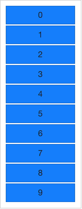
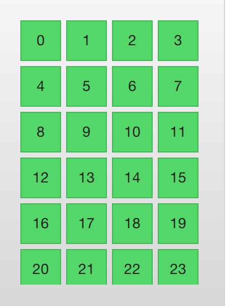
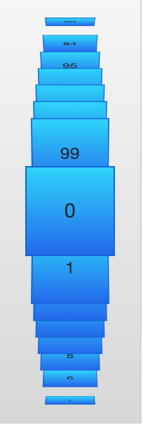
In its simplest form, the repeater can be used to instantiate a specified number of items. Each item will have access to an attached property, the variable index, that can be used to tell the items apart. In the example below, a repeater is used to create 10 instances of an item. The number of items are controlled using the model property. For each item, the Rectangle containing a Text element found inside the Repeater item, is instantiated. As you can tell, the text property is set to the index value, thus the items are numbered from zero to nine.
import QtQuick 2.5
import "../common"

Column {
    spacing: 2

    Repeater {
        model: 10
        BlueBox {
            width: 120
            height: 32
            text: index
        }
    }
}
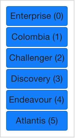
As nice as lists of numbered items are, it is sometimes interesting to display a more complex data set. By replacing the integer model value with a JavaScript array, we can achieve that. The contents of the array can be of any type, be it strings, integers or objects. In the example below, a list of strings is used. We can still access and use the index variable, but we also have access to modelData containing the data for each element in the array.
import QtQuick 2.5
import "../common"

Column {
    spacing: 2

    Repeater {
        model: ["Enterprise", "Columbia", "Challenger", "Discovery", "Endeavour", "Atlantis"]

        BlueBox {
            width: 100
            height: 32
            radius: 3

            text: modelData + ' (' + index + ')'
        }
    }
}
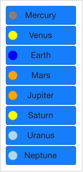
Being able to expose the data of an array, you soon find yourself in a position where you need multiple pieces of data per item in the array. This is where models enter the picture. One of the most trivial models, and one of the most commonly used, is the ListModel. A list model is simply a collection of ListElement items. Inside each list element, a number of properties can be bound to values. For instance, in the example below, a name and a color is provided for each element.
The properties bound inside each element are attached to each instantiated item by the repeater. This means that the variables name and surfaceColor are available from within the scope of each Rectangle and Text item created by the repeater. This not only makes it easy to access the data, it also makes it easy to read the source code. The surfaceColor is the color of the circle to the left of the name, not something obscure as data from column i of row j.
import QtQuick 2.5
import "../common"

Column {
    spacing: 2

    Repeater {
        model: ListModel {
            ListElement { name: "Mercury"; surfaceColor: "gray" }
            ListElement { name: "Venus"; surfaceColor: "yellow" }
            ListElement { name: "Earth"; surfaceColor: "blue" }
            ListElement { name: "Mars"; surfaceColor: "orange" }
            ListElement { name: "Jupiter"; surfaceColor: "orange" }
            ListElement { name: "Saturn"; surfaceColor: "yellow" }
            ListElement { name: "Uranus"; surfaceColor: "lightBlue" }
            ListElement { name: "Neptune"; surfaceColor: "lightBlue" }
        }

        BlueBox {
            width: 120
            height: 32

            radius: 3
            text: name

            Box {
                anchors.left: parent.left
                anchors.verticalCenter: parent.verticalCenter
                anchors.leftMargin: 4

                width: 16
                height: 16

                radius: 8

                color: surfaceColor
            }
        }
    }
}
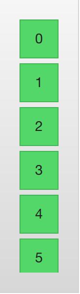
The contents of the repeater that is being instantiated for each item is actually what is bound to the default property, delegate. This means that the code of example Example 01 is synonymous to the code shown below. Notice that the only difference is that the delegate property name is spelled out explicitly in the latter.
import QtQuick 2.5
import "../common"

Column {
    spacing: 2

    Repeater {
        model: 10

        delegate: BlueBox {
            width: 100
            height: 32
            text: index
        }
    }
}
Dynamic Views
Repeaters work well for limited and static sets of data, but in the real world, models are commonly more complex – and larger. Here, a smarter solution is needed. For this, Qt Quick provides the ListView and GridView elements. These are both based on a Flickable area, so the user can move around in a larger data set. At the same time, they limit the number of concurrently instantiated delegates. For a large model, that means fewer elements in the scene at once.
The two elements are similar in their usage. Thus, we will begin with the ListView and then describe the GridView with the former as the starting point of the comparison.
The ListView is similar to the Repeater element. It uses a model, instantiates a delegate and between the delegates, there can be spacing. The listing below shows how a simple setup can look.
import QtQuick 2.5
import "../common"

Background {
    width: 80
    height: 300

    ListView {
        anchors.fill: parent
        anchors.margins: 20

        clip: true

        model: 100

        delegate: numberDelegate
        spacing: 5
    }

    Component {
        id: numberDelegate

        GreenBox {
            width: 40
            height: 40
            text: index
        }
    }
}
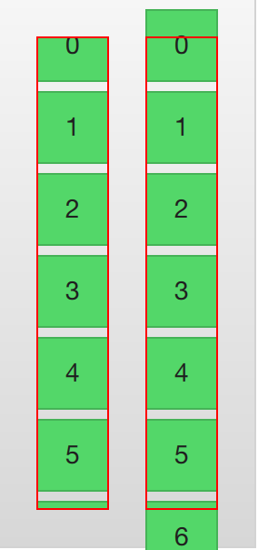
If the model contains more data than can fit onto the screen, the ListView only shows part of the list. However, as a consequence of the default behavior of Qt Quick, the list view does not limit the screen area within which the delegates are shown. This means that delegates may be visible outside the list view, and that the dynamic creation and destruction of delegates outside the list view is visible to the user. To prevent this, clipping must be activated on the ListView element by setting the clip property to true. The illustration below shows the result of this, compared to when the clip property is left as false.
To the user, the ListView is a scrollable area. It supports kinetic scrolling, which means that it can be flicked to quickly move through the contents. By default, it also can be stretched beyond the end of contents, and then bounces back, to signal to the user that the end has been reached.
The behavior at the end of the view is controlled using the boundsBehavior property. This is an enumerated value and can be configured from the default behavior, Flickable.DragAndOvershootBounds, where the view can be both dragged and flicked outside its boundaries, to Flickable.StopAtBounds, where the view never will move outside its boundaries. The middle ground, Flickable.DragOverBounds lets the user drag the view outside its boundaries, but flicks will stop at the boundary.
It is possible to limit the positions where a view is allowed to stop. This is controlled using the snapMode property. The default behavior, ListView.NoSnap, lets the view stop at any position. By setting the snapMode property to ListView.SnapToItem, the view will always align the top of an item with its top. Finally, the ListView.SnapOneItem, the view will stop no more than one item from the first visible item when the mouse button or touch was released. The last mode is very handy when flipping through pages.
Orientation
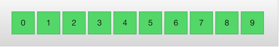
The list view provides a vertically scrolling list by default, but horizontal scrolling can be just as useful. The direction of the list view is controlled through the orientation property. It can be set to either the default value, ListView.Vertical, or to ListView.Horizontal. A horizontal list view is shown below.
import QtQuick 2.5
import "../common"

Background {
    width: 480
    height: 80

    ListView {
        anchors.fill: parent
        anchors.margins: 20
        spacing: 4
        clip: true
        model: 100
        orientation: ListView.Horizontal
        delegate: numberDelegate
    }

    Component {
        id: numberDelegate

        GreenBox {
            width: 40
            height: 40
            text: index
        }
    }
}
As you can tell, the direction of the horizontal flows from the left to the right by default. This can be controlled through the layoutDirection property, which can be set to either Qt.LeftToRight or Qt.RightToLeft, depending on the flow direction.
Keyboard Navigation and Highlighting
When using a ListView in a touch based setting, the view itself is enough. In a scenario with a keyboard, or even just arrow keys to select an item, a mechanism to indicate the current item is needed. In QML, this is called highlighting.
Views support a highlight delegate which is shown in the view together with the delegates. It can be considered an additional delegate, only that it is only instantiated once, and is moved into the same position as the current item.
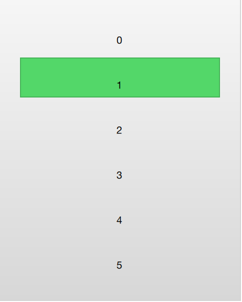
In the example below this is demonstrated. There are two properties involved for this to work. First, the focus property is set to true. This gives the ListView the keyboard focus. Second, the highlight property is set to point out the highlighting delegate to use. The highlight delegate is given the x, y and height of the current item. If the width is not specified, the width of the current item is also used.
In the example, the ListView.view.width attached property is used for width. The attached properties available to delegates are discussed further in the delegate section of this chapter, but it is good to know that the same properties are available to highlight delegates as well.
import QtQuick 2.5
import "../common"

Background {
    width: 240
    height: 300

    ListView {
        id: view
        anchors.fill: parent
        anchors.margins: 20

        clip: true

        model: 100

        delegate: numberDelegate
        spacing: 5

        highlight: highlightComponent
        focus: true
    }

    Component {
        id: highlightComponent

        GreenBox {
            width: ListView.view.width
        }
    }

    Component {
        id: numberDelegate

        Item {
            width: ListView.view.width
            height: 40

            Text {
                anchors.centerIn: parent

                font.pixelSize: 10

                text: index
            }
        }
    }
}
When using a highlight in conjunction with a ListView, a number of properties can be used to control its behavior. The highlightRangeMode controls how the highlight is affected by what is shown in the view. The default setting, ListView.NoHighlightRange means that the highlight and the visible range of items in the view not are related at all.
The value ListView.StrictlyEnforceRange ensures that the highlight is always visible. If an action attempts to move the highlight outside the visible part of the view, the current item will change accordingly, so that the highlight remains visible.
The middle ground is the ListView.ApplyRange value. It attempts to keep the highlight visible, but does not alter the current item to enforce this. Instead, the highlight is allowed to move out of view if necessary.
In the default configuration, the view is responsible for moving the highlight into position. The speed of the movement and resizing can be controlled, either as a speed or as a duration. The properties involved are highlightMoveSpeed, highlightMoveDuration, highlightResizeSpeed and highlightResizeDuration. By default, the speed is set to 400 pixels per second, and the duration is set to -1, indicating that the speed and distance control the duration. If both a speed and a duration is set, the one that results in the quickest animation is chosen.
To control the movement of the highlight more in detail, the highlightFollowCurrentItem property can be set to false. This means that the view is no longer responsible for the movement of the highlight delegate. Instead, the movement can be controlled through a Behavior or an animation.
In the example below, the y property of the highlight delegate is bound to the ListView.view.currentItem.y attached property. This ensures that the highlight follows the current item. However, as we do not let the view move the highlight, we can control how the element is moved. This is done through the Behavior on y. In the example below, the movement is divided into three steps: fading out, moving, before fading in. Notice how SequentialAnimation and PropertyAnimation elements can be used in combination with the NumberAnimation to create a more complex movement.
    Component {
        id: highlightComponent

        Item {
            width: ListView.view.width
            height: ListView.view.currentItem.height

            y: ListView.view.currentItem.y

            Behavior on y {
                SequentialAnimation {
                    PropertyAnimation { target: highlightRectangle; property: "opacity"; to: 0; duration: 200 }
                    NumberAnimation { duration: 1 }
                    PropertyAnimation { target: highlightRectangle; property: "opacity"; to: 1; duration: 200 }
                }
            }

            GreenBox {
                id: highlightRectangle
                anchors.fill: parent
            }
        }
    }
Header and Footer
At the end of the ListView contents, a header and a footer element can be inserted. These can be considered special delegates places at the beginning or end of the list. For a horizontal list, these will not appear at the head or foot, but rather at then beginning or end, depending on the layoutDirection used.
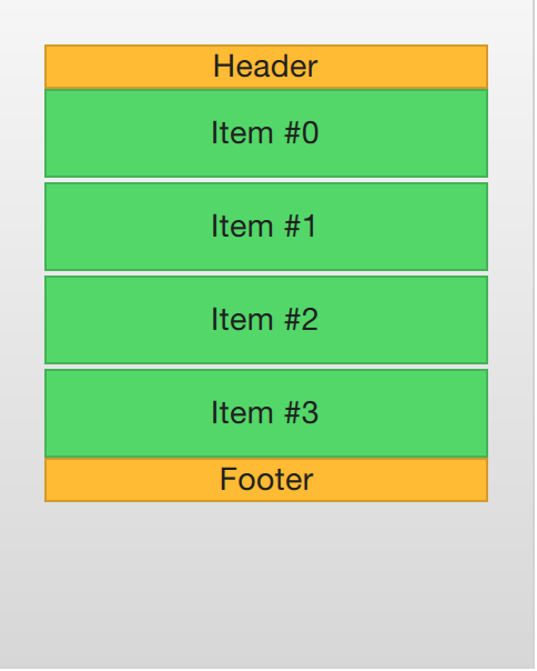
The example below illustrates how an header and footer can be used to enhance the perception of the beginning and end of a list. There are other uses for these special list elements. For instance, they can be used to keep buttons to load more contents.
import QtQuick 2.5
import "../common"

Background {
    width: 240
    height: 300

    ListView {
        anchors.fill: parent
        anchors.margins: 20

        clip: true

        model: 4

        delegate: numberDelegate
        spacing: 2

        header: headerComponent
        footer: footerComponent
    }

    Component {
        id: headerComponent

        YellowBox {
            width: ListView.view.width
            height: 20
            text: 'Header'

        }
    }

    Component {
        id: footerComponent

        YellowBox {
            width: ListView.view.width
            height: 20
            text: 'Footer'
        }
    }

    Component {
        id: numberDelegate

        GreenBox {
            width: ListView.view.width
            height: 40
            text: 'Item #' + index
        }
    }
}
Note
Header and footer delegates do not respect the spacing property of a ListView, instead they are placed directly adjacent to the next item delegate in the list. This means that any spacing must be a part of the header and footer items.
The GridView
Using a GridView is very similar to using a ListView. The only real difference is that the grid view places the delegates in a two dimensional grid instead of in a linear list.
Compared to a list view, the grid view does not rely on spacing and the size of its delegates. Instead, it uses the cellWidth and cellHeight properties to control the dimensions of the contents delegates. Each delegate item is then places in the top left corner of each such cell.
import QtQuick 2.5
import "../common"

Background {
    width: 220
    height: 300

    GridView {
        id: view
        anchors.fill: parent
        anchors.margins: 20

        clip: true

        model: 100

        cellWidth: 45
        cellHeight: 45

        delegate: numberDelegate
    }

    Component {
        id: numberDelegate

        GreenBox {
            width: 40
            height: 40
            text: index
        }
    }
}
A GridView contains headers and footers, can use a highlight delegate and supports snap modes as well as various bounds behaviors. It can also be orientated in different directions and orientations.
The orientation is controlled using the flow property. It can be set to either GridView.LeftToRight or GridView.TopToBottom. The former value fills a grid from the left to the right, adding rows from the top to the bottom. The view is scrollable in the vertical direction. The latter value adds items from the top to the bottom, filling the view from left to right. The scrolling direction is horizontal in this case.
In addition to the flow property, the layoutDirection property can adapt the direction of the grid to left-to-right or right-to-left languages, depending on the value used.
Delegate
When it comes to using models and views in a custom user interface, the delegate plays a huge role in creating a look. As each item in a the model are visualized through a delegate, what is actually visible to the user are the delegates.
Each delegate gets access to a number of attached properties, some from the data model, others from the view. From the model, the properties convey the data for each item to the delegate. From the view, the properties convey state information related to the delegate within the view.
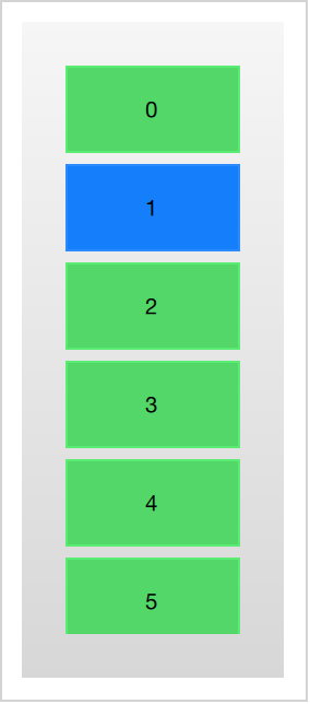
The most commonly used properties attached from the view are ListView.isCurrentItem and ListView.view. The first is a boolean indicating if the item is the current item, while the latter is a read-only reference to the actual view. Through access to the view, it is possible to create general, reusable delegates that adapt to the size and nature of the view in which they are contained. In the example below, the width of each delegate is bound to the width of the view, while the background color of each delegate depends on the attached ListView.isCurrentItem property.
import QtQuick 2.5

Rectangle {
    width: 120
    height: 300

    gradient: Gradient {
        GradientStop { position: 0.0; color: "#f6f6f6" }
        GradientStop { position: 1.0; color: "#d7d7d7" }
    }

    ListView {
        anchors.fill: parent
        anchors.margins: 20

        clip: true

        model: 100

        delegate: numberDelegate
        spacing: 5

        focus: true
    }

    Component {
        id: numberDelegate

        Rectangle {
            width: ListView.view.width
            height: 40

            color: ListView.isCurrentItem?"#157efb":"#53d769"
            border.color: Qt.lighter(color, 1.1)

            Text {
                anchors.centerIn: parent

                font.pixelSize: 10

                text: index
            }
        }
    }
}
If each item in the model is associated with an action, for instance, clicking an item acts upon it, that functionality is a part of each delegate. This divides the event management between the view, which handles the navigation between items in the view, and the delegate which handles actions on a specific item.
The most basic way to do this is to create a MouseArea within each delegate and act on the onClicked signal. This is demonstrated in the example in the next section of this chapter.
Animating Added and Removed Items
In some cases, the contents shown in a view changes over time. Items are added and removed as the underlaying data model is altered. In these cases, it is often a good idea to employ visual ques to give the user a sense of direction and to help the user understand what data is added or removed.
Conveniently enough, QML views attaches two signals, onAdd and onRemove, to each item delegate. By connecting animations to these, it is easy to create the movement necessary to aid the user in identifying what is taking place.
The example below demonstrates this through the use of a dynamically populated ListModel. At the bottom of the screen, a button for adding new items is shown. When it is clicked, a new item is added to the model using the append method. This triggers the creation of a new delegate in the view, and the emission of the GridView.onAdd signal. The SequentialAnimation attached to the signal causes the item to zoom into view by animating the scale property of the delegate.
When a delegate in the view is clicked, the item is removed from the model through a call to the remove method. This causes the GridView.onRemove signal to be emitted, triggering another SequentialAnimation. This time, however, the destruction of the delegate must be delayed until the animation has completed. To do this, PropertyAction element are used to set the GridView.delayRemove property to true before the animation, and false after. This ensures that the animation is allowed to complete before the delegate item is removed.
import QtQuick 2.5

Rectangle {
    width: 480
    height: 300

    gradient: Gradient {
        GradientStop { position: 0.0; color: "#dbddde" }
        GradientStop { position: 1.0; color: "#5fc9f8" }
    }

    ListModel {
        id: theModel

        ListElement { number: 0 }
        ListElement { number: 1 }
        ListElement { number: 2 }
        ListElement { number: 3 }
        ListElement { number: 4 }
        ListElement { number: 5 }
        ListElement { number: 6 }
        ListElement { number: 7 }
        ListElement { number: 8 }
        ListElement { number: 9 }
    }

    Rectangle {
        anchors.left: parent.left
        anchors.right: parent.right
        anchors.bottom: parent.bottom
        anchors.margins: 20

        height: 40

        color: "#53d769"
        border.color: Qt.lighter(color, 1.1)

        Text {
            anchors.centerIn: parent

            text: "Add item!"
        }

        MouseArea {
            anchors.fill: parent

            onClicked: {
                theModel.append({"number": ++parent.count});
            }
        }

        property int count: 9
    }

    GridView {
        anchors.fill: parent
        anchors.margins: 20
        anchors.bottomMargin: 80

        clip: true

        model: theModel

        cellWidth: 45
        cellHeight: 45

        delegate: numberDelegate
    }

    Component {
        id: numberDelegate

        Rectangle {
            id: wrapper

            width: 40
            height: 40

            gradient: Gradient {
                GradientStop { position: 0.0; color: "#f8306a" }
                GradientStop { position: 1.0; color: "#fb5b40" }
            }

            Text {
                anchors.centerIn: parent

                font.pixelSize: 10

                text: number
            }

            MouseArea {
                anchors.fill: parent

                onClicked: {
                    theModel.remove(index);
                }
            }

            GridView.onRemove: SequentialAnimation {
                PropertyAction { target: wrapper; property: "GridView.delayRemove"; value: true }
                NumberAnimation { target: wrapper; property: "scale"; to: 0; duration: 250; easing.type: Easing.InOutQuad }
                PropertyAction { target: wrapper; property: "GridView.delayRemove"; value: false }
            }

            GridView.onAdd: SequentialAnimation {
                NumberAnimation { target: wrapper; property: "scale"; from: 0; to: 1; duration: 250; easing.type: Easing.InOutQuad }
            }
        }
    }
}
Shape-Shifting Delegates
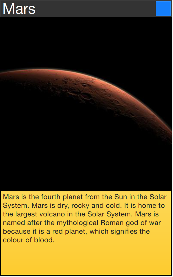
A commonly used mechanism in lists is that the current item is expanded when activated. This can be used to dynamically let the item expand to fill the screen to enter a new part of the user interface, or it can be used to provide slightly more information for the current item in a given list.
In the example below, each item is expanded to the full extent of the ListView containing it when clicked. The extra spaced is then used to add more information. The mechanism used to control this is a state, expanded that each item delegate can enter, where the item is expanded. In that state, a number of properties are altered.
First of all, the height of the wrapper is set to the height of the ListView. The thumbnail image is then enlarged and moved down to make it move from its small position into its larger position. In addition to this, the two hidden items, the factsView and closeButton are shown by altering the opacity of the elements. Finally, the ListView is setup.
Setting up the ListView involves setting the contentsY, that is the top of the visible part of the view, to the y value of the delegate. The other change is to set interactive of the view to false. This prevents the view from moving. The user can no longer scroll through the list or change the current item.
As the item first is clicked, it enters the expanded state, causing the item delegate to fill the ListView and the contents to rearrange. When the close button is clicked, the state is cleared, causing the delegate to return to its previous state and re-enabling the ListView.
import QtQuick 2.5
Item {
width: 300
height: 480
Rectangle {
anchors.fill: parent
gradient: Gradient {
GradientStop { position: 0.0; color: "#4a4a4a" }
GradientStop { position: 1.0; color: "#2b2b2b" }
}
}
ListView {
id: listView
anchors.fill: parent
delegate: detailsDelegate
model: planets
}
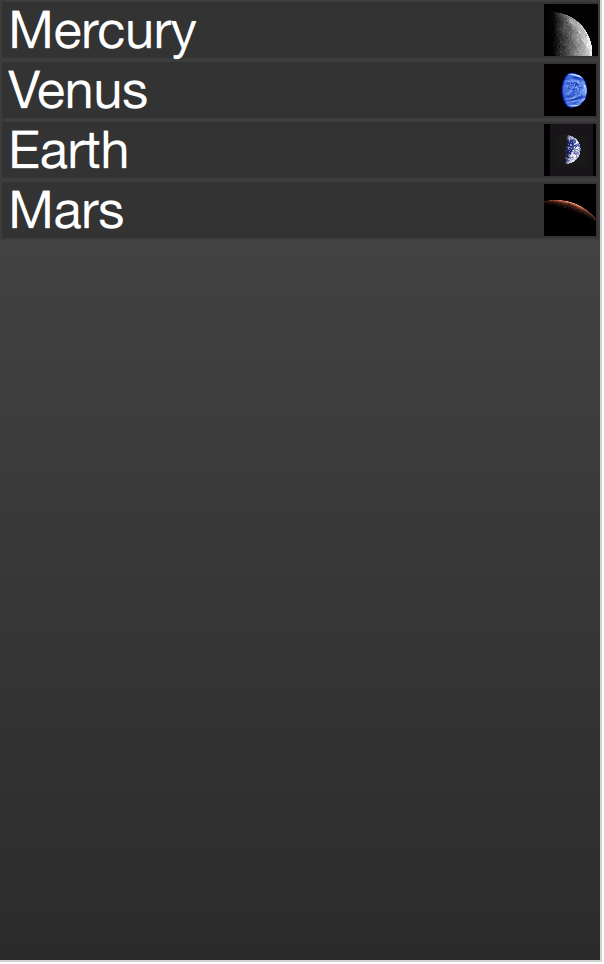
ListModel {
id: planets
ListElement { name: "Mercury"; imageSource: "images/mercury.jpeg"; facts: "Mercury is the smallest planet in the Solar System. It is the closest planet to the sun. It makes one trip around the Sun once every 87.969 days." }
ListElement { name: "Venus"; imageSource: "images/venus.jpeg"; facts: "Venus is the second planet from the Sun. It is a terrestrial planet because it has a solid, rocky surface. The other terrestrial planets are Mercury, Earth and Mars. Astronomers have known Venus for thousands of years." }
ListElement { name: "Earth"; imageSource: "images/earth.jpeg"; facts: "The Earth is the third planet from the Sun. It is one of the four terrestrial planets in our Solar System. This means most of its mass is solid. The other three are Mercury, Venus and Mars. The Earth is also called the Blue Planet, 'Planet Earth', and 'Terra'." }
ListElement { name: "Mars"; imageSource: "images/mars.jpeg"; facts: "Mars is the fourth planet from the Sun in the Solar System. Mars is dry, rocky and cold. It is home to the largest volcano in the Solar System. Mars is named after the mythological Roman god of war because it is a red planet, which signifies the colour of blood." }
}
Component {
id: detailsDelegate
Item {
id: wrapper
width: listView.width
height: 30
Rectangle {
anchors.left: parent.left
anchors.right: parent.right
anchors.top: parent.top
height: 30
color: "#333"
border.color: Qt.lighter(color, 1.2)
Text {
anchors.left: parent.left
anchors.verticalCenter: parent.verticalCenter
anchors.leftMargin: 4
font.pixelSize: parent.height-4
color: '#fff'
text: name
}
}
Rectangle {
id: image
width: 26
height: 26
anchors.right: parent.right
anchors.top: parent.top
anchors.rightMargin: 2
anchors.topMargin: 2
color: "black"
Image {
anchors.fill: parent
fillMode: Image.PreserveAspectFit
source: imageSource
}
}
MouseArea {
anchors.fill: parent
onClicked: parent.state = "expanded"
}
Item {
id: factsView
anchors.top: image.bottom
anchors.left: parent.left
anchors.right: parent.right
anchors.bottom: parent.bottom
opacity: 0
Rectangle {
anchors.fill: parent
gradient: Gradient {
GradientStop { position: 0.0; color: "#fed958" }
GradientStop { position: 1.0; color: "#fecc2f" }
}
border.color: '#000000'
border.width: 2
Text {
anchors.fill: parent
anchors.margins: 5
clip: true
wrapMode: Text.WordWrap
color: '#1f1f21'
font.pixelSize: 12
text: facts
}
}
}
Rectangle {
id: closeButton
anchors.right: parent.right
anchors.top: parent.top
anchors.rightMargin: 2
anchors.topMargin: 2
width: 26
height: 26
color: "#157efb"
border.color: Qt.lighter(color, 1.1)
opacity: 0
MouseArea {
anchors.fill: parent
onClicked: wrapper.state = ""
}
}
states: [
State {
name: "expanded"
PropertyChanges { target: wrapper; height: listView.height }
PropertyChanges { target: image; width: listView.width; height: listView.width; anchors.rightMargin: 0; anchors.topMargin: 30 }
PropertyChanges { target: factsView; opacity: 1 }
PropertyChanges { target: closeButton; opacity: 1 }
PropertyChanges { target: wrapper.ListView.view; contentY: wrapper.y; interactive: false }
}
]
transitions: [
Transition {
NumberAnimation {
duration: 200;
properties: "height,width,anchors.rightMargin,anchors.topMargin,opacity,contentY"
}
}
]
}
}
}
The techniques demonstrated here to expand the delegate to fill the entire view can be employed to make an item delegate shift shape in a much smaller way. For instance, when browsing through a list of songs, the current item could be made slightly larger, accommodating more information about that particular item.
Advanced Techniques
The PathView
The PathView element is the most powerful, but also the most complex, view provided in Qt Quick. It makes it possible to create a view where the items are laid out along an arbitrary path. Along the same path, attributes such as scale, opacity and more can be controlled in detail.
When using the PathView, you have to define a delegate and a path. In addition to this, the PathView itself can be customized through a range of properties. The most common being pathItemCount, controlling the number of visible items at once, and the highlight range control properties preferredHighlightBegin, preferredHighlightEnd and highlightRangeMode, controlling where along the path the current item is to be shown.
Before looking at the highlight range control properties in depth, we must look at the path property. The path property expects a Path element defining the path that the delegates follows as the PathView is being scrolled. The path is defined using the startX and startY properties in combinations with path elements such as PathLine, PathQuad and PathCubic. These elements are joined together to form a two-dimensional path.
Todo
do we cover the line, quad and cubic through an illustration, or do we need a paragraph on them?
When the path has been defined, it is possible to further tune it using PathPercent and PathAttribute elements. These are placed in between path elements and provides a more fine grained control over the path and the delegates on it. The PathPercent controls how large a portion of the path that has been covered between each element. This, in turn, controls the distribution of delegates along the path, as they are distributed proportionally to the percentage progressed.
This is where the preferredHighlightBegin and preferredHighlightEnd properties of the PathView enters the picture. They both expect real values in the range between zero and one. The end is also expected to be more or equal to the beginning. Setting both these properties to, for instance, 0.5, the current item will be displayed at the location fifty percent along the path.
In the Path, the PathAttribute elements are placed between elements, just as PathPercent elements. They let you specify property values that are interpolated along the path. These properties are attached to the delegates and can be used to control any conceivable property.
The example below demonstrates how the PathView element is used to create view of cards that the user can flip through. It employs a number of tricks to do this. The path consists of three PathLine elements. Using PathPercent elements, the central element is properly centered and provided enough space not to be cluttered by other elements. Using PathAttribute elements, the rotation, size and z-value are controlled.
In addition to the path, the pathItemCount property of the PathView has been set. This controls how densely populated the path will be. The preferredHighlightBegin and preferredHighlightEnd the PathView.onPath is used to control the visibility of the delegates.
    PathView {
        anchors.fill: parent

        delegate: flipCardDelegate
        model: 100

        path: Path {
            startX: root.width/2
            startY: 0

            PathAttribute { name: "itemZ"; value: 0 }
            PathAttribute { name: "itemAngle"; value: -90.0; }
            PathAttribute { name: "itemScale"; value: 0.5; }
            PathLine { x: root.width/2; y: root.height*0.4; }
            PathPercent { value: 0.48; }
            PathLine { x: root.width/2; y: root.height*0.5; }
            PathAttribute { name: "itemAngle"; value: 0.0; }
            PathAttribute { name: "itemScale"; value: 1.0; }
            PathAttribute { name: "itemZ"; value: 100 }
            PathLine { x: root.width/2; y: root.height*0.6; }
            PathPercent { value: 0.52; }
            PathLine { x: root.width/2; y: root.height; }
            PathAttribute { name: "itemAngle"; value: 90.0; }
            PathAttribute { name: "itemScale"; value: 0.5; }
            PathAttribute { name: "itemZ"; value: 0 }
        }

        pathItemCount: 16

        preferredHighlightBegin: 0.5
        preferredHighlightEnd: 0.5
    }
The delegate, shown below, utilizes the attached properties itemZ, itemAngle and itemScale from the PathAttribute elements. It is worth noticing that the attached properties of the delegate only are available from the wrapper. Thus, the rotX property is defined to be able to access the value from within the Rotation element.
Another detail specific to PathView worth noticing is the usage of the attached PathView.onPath property. It is common practice to bind the visibility to this, as this allows the PathView to keep invisible elements for caching purposes. This can usually not be handled through clipping, as the item delegates of a PathView are placed more freely than the item delegates of ListView or GridView views.
    Component {
        id: flipCardDelegate

        BlueBox {
            id: wrapper

            width: 64
            height: 64
            antialiasing: true

            gradient: Gradient {
                GradientStop { position: 0.0; color: "#2ed5fa" }
                GradientStop { position: 1.0; color: "#2467ec" }
            }


            visible: PathView.onPath

            scale: PathView.itemScale
            z: PathView.itemZ

            property variant rotX: PathView.itemAngle
            transform: Rotation {
                axis { x: 1; y: 0; z: 0 }
                angle: wrapper.rotX;
                origin { x: 32; y: 32; }
            }
            text: index
        }
    }
When transforming images or other complex elements on in PathView, a performance optimization trick that is common to use is to bind the smooth property of the Image element to the attached property PathView.view.moving. This means that the images are less pretty while moving, but smoothly transformed when stationary. There is no point spending processing power on smooth scaling when the view is in motion, as the user will not be able to see this anyway.
A Model from XML
As XML is an ubiquitous data format, QML provides the XmlListModel element that exposes XML data as a model. The element can fetch XML data locally or remotely and then processes the data using XPath expressions.
The example below demonstrates fetching images from an RSS flow. The source property refers to a remove location over HTTP, and the data is automatically downloaded.
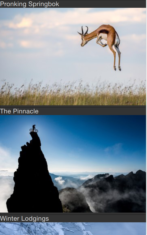
When the data has been downloaded, it is processed into model items and roles. The query property is an XPath representing the base query for creating model items. In this example, the path is /rss/channel/item, so for every item tag, inside a channel tag, inside an RSS tag, a model item is created.
For every model item, a number of roles are extracted. These are represented by XmlRole elements. Each role is given a name, which the delegate can access through an attached property. The actual value of each such property is determined through the XPath query for each role. For instance, the title property corresponds to the title/string() query, returning the contents between the <title> and </title> tags.
The imageSource property is more interesting as it not only extracts a string from the XML, but also processes it. In the stream provided, every item contains an image, represented by an <img src= tag. Using the substring-after and substring-before XPath functions, the location of the image is extracted and returned. Thus the imageSource property can be used directly as the source for an Image element.
import QtQuick 2.5
import QtQuick.XmlListModel 2.0
import "../common"

Background {
    width: 300
    height: 480

    Component {
        id: imageDelegate

        Box {
            width: listView.width
            height: 220
            color: '#333'

            Column {
                Text {
                    text: title
                    color: '#e0e0e0'
                }
                Image {
                    width: listView.width
                    height: 200
                    fillMode: Image.PreserveAspectCrop
                    source: imageSource
                }
            }
        }
    }

    XmlListModel {
        id: imageModel

        source: "http://feeds.nationalgeographic.com/ng/photography/photo-of-the-day/"
        query: "/rss/channel/item"

        XmlRole { name: "title"; query: "title/string()" }
        XmlRole { name: "imageSource"; query: "substring-before(substring-after(description/string(), 'img src=\"'), '\"')" }
    }

    ListView {
        id: listView
        anchors.fill: parent
        model: imageModel
        delegate: imageDelegate
    }
}
Lists with Sections
Sometimes, the data in a list can be divided into sections. It can be as simple as dividing a list of contacts into sections under each letter of the alphabet or music tracks under albums. Using a ListView it is possible to divide a flat list into categories, providing more depth to the experience.
In order to use sections, the section.property and section.criteria must be setup. The section.property defines which property to use to divide the contents into sections. Here, it is important to know that the model must be sorted so that each section consists of continuous elements, otherwise, the same property name might appear in multiple locations.
The section.criteria can be set to either ViewSection.FullString or ViewSection.FirstCharacter. The first is the default value and can be used for models that have clear sections, for example tracks of music albums. The latter takes the first character of a property and means that any property can be used for this. The most common example being the last name of contacts in a phone book.
When the sections have been defined, they can be accessed from each item using the attached properties ListView.section, ListView.previousSection and ListView.nextSection. Using these properties, it is possible to detect the first and last item of a section and act accordingly.
It is also possible to assign a section delegate component to the section.delegate property of a ListView. This creates a section header delegate which is inserted before any items of a section. The delegate component can access the name of the current section using the attached property section.
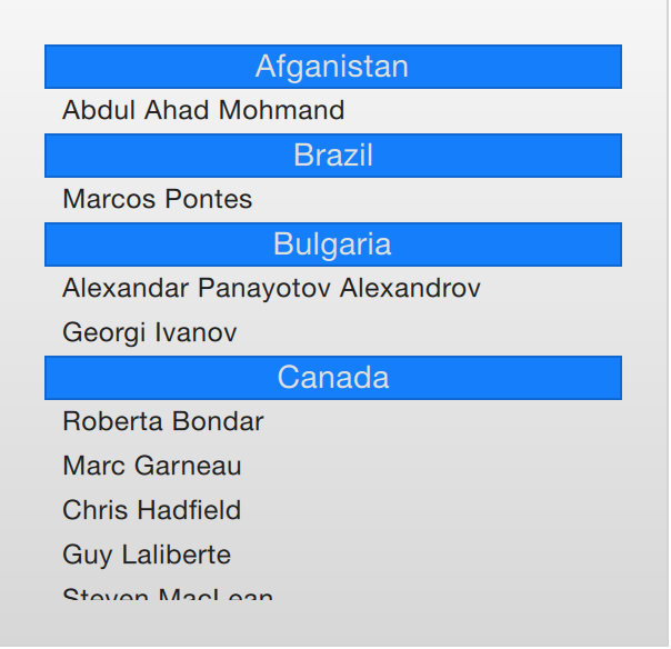
The example below demonstrates the section concept by showing a list of space men sectioned after their nationality. The nation is used as the section.property. The section.delegate component, sectionDelegate, shows a heading for each nation, displaying the name of the nation. In each section, the names of the space men are shown using the spaceManDelegate component.
import QtQuick 2.5
import "../common"

Background {
    width: 300
    height: 290

    ListView {
        anchors.fill: parent
        anchors.margins: 20

        clip: true

        model: spaceMen

        delegate: spaceManDelegate

        section.property: "nation"
        section.delegate: sectionDelegate
    }

    Component {
        id: spaceManDelegate

        Item {
            width: ListView.view.width
            height: 20
            Text {
                anchors.left: parent.left
                anchors.verticalCenter: parent.verticalCenter
                anchors.leftMargin: 8
                font.pixelSize: 12
                text: name
                color: '#1f1f1f'
            }
        }
    }

    Component {
        id: sectionDelegate

        BlueBox {
            width: ListView.view.width
            height: 20
            text: section
            fontColor: '#e0e0e0'
        }
    }


    ListModel {
        id: spaceMen

        ListElement { name: "Abdul Ahad Mohmand"; nation: "Afganistan"; }
        ListElement { name: "Marcos Pontes"; nation: "Brazil"; }
        ListElement { name: "Alexandar Panayotov Alexandrov"; nation: "Bulgaria"; }
        ListElement { name: "Georgi Ivanov"; nation: "Bulgaria"; }
        ListElement { name: "Roberta Bondar"; nation: "Canada"; }
        ListElement { name: "Marc Garneau"; nation: "Canada"; }
        ListElement { name: "Chris Hadfield"; nation: "Canada"; }
        ListElement { name: "Guy Laliberte"; nation: "Canada"; }
        ListElement { name: "Steven MacLean"; nation: "Canada"; }
        ListElement { name: "Julie Payette"; nation: "Canada"; }
        ListElement { name: "Robert Thirsk"; nation: "Canada"; }
        ListElement { name: "Bjarni Tryggvason"; nation: "Canada"; }
        ListElement { name: "Dafydd Williams"; nation: "Canada"; }
    }
}
Tuning Performance
The perceived performance of a view of a model depends very much on the time needed to prepare new delegates. For instance, when scrolling downwards through a ListView, delegates are added just outside the view on the bottom and are removed just as they leave sight over the top of the view. This becomes apparent if the clip property is set to false. If the delegates takes too much time to initialize, it will become apparent to the user as soon as the view is scrolled too quickly.
To work around this issue you can tune the margins, in pixels, on the sides of a scrolling view. This is done using the cacheBuffer property. In the case described above, vertical scrolling, it will control how many pixels above and below the ListView that will contain prepared delegates. Combining this with asynchronously loading Image elements can, for instance, give the images time to load before they are brought into view.
Having more delegates sacrifices memory for a smoother experience and slightly more time to initialize each delegate. This does not solve the problem of complex delegates. Each time a delegate is instantiated, its contents is evaluated and compiled. This takes time, and if it takes too much time, it will lead to a poor scrolling experience. Having many elements in a delegate will also degrade the scrolling performance. It simply costs cycles to move many elements.
To remedy the two later issues, it is recommended to use Loader elements. These can be used to instantiate additional elements when they are needed. For instance, an expanding delegate may use a Loader to postpone the instantiation of its detailed view until it is needed. For the same reason, it is good to keep the amount of JavaScript to a minimum in each delegate. It is better to let them call complex pieced of JavaScript that reside outside each delegate. This reduces the time spent compiling JavaScript each time a delegate is created.
Summary
In this chapter, we have looked at models, views and delegates. For each data entry in a model, a view instantiates a delegate visualizing the data. This separates the data from the presentation.
A model can be a single integer, where the index variable is provided to the delegate. If a JavaScript array is used as model, the modelData variable represents the data of the current index of the array, while index holds the index. For more complex cases, where multiple values needs to be provided by each data item, a ListModel populated with ListElement items is a better solution.
For static models, a Repeater can be used as the view. It is easy to combine it with a positioner such as Row, Column, Grid or Flow to build user interface parts. For dynamic or large data models, a view such as ListView or GridView are more appropriate. These create delegate instances on the fly as they are needed, reducing the number of elements live in the scene at once.
The delegates used in the views can be static items with properties bound to data from the model, or they can be dynamic, with states depending on if they are in focus or not. Using the onAdd and onRemove signals of the view, they can even be animated as they appear and disappear.