You will find the chapter examples in the assets folder.
Translations started for Italian, German and Portuguese. Use the floating menu on the bottom right.
The source of this fork of the book is hosted on GitHub (fork temporarily used for translation). The original source is hosted on GitHub. The original source is hosted on Patches, suggestions and comments are welcome.

Das Modell-Ansicht-Delegaten-Konzept (teilweise dt.)
Autor des Abschnitts: e8johan
Bemerkung
Letzter Build: März 14, 2018 at 02:55 CET
Der Quellcode für dieses Kapitel befindet sich im assets Verzeichnis.
In Qt Quick werden Daten und Darstellung der Daten durch ein Konzept getrennt. Für die Darstellung der Daten werden für einzelne Datenelemente sogenannten Delegaten (“delegate”) verwendet. Qt Quick hat bereits einige Modelle und Darstellungen vordefiniert. Um diese verwenden zu können, muss man diese Klassen verstehen und wissen wie man zugehörige Delegaten erstellt.
Das Konzept
Ganz wichtig beim Entwickeln eines User Interfaces ist es, die Trennung von Daten und Darstellung zu beherzigen. Zum Beispiel könnte man ein Adressbuch als vertikale List von Texteinträgen oder als eine Tabelle von Bildern der Kontakte arrangieren. In beiden Fällen sind die Daten identisch: das Adressbuch aber die Visualisierung ist völlig anders. Die Aufteilung wird üblicherweise Model-View-Konzept genannt. In dem Konzept ist das Telefonbuch das Modell und die Darstellung ist der “view”.
In QML werden Modell und Ansicht über sogenannte Delegaten (“delegates”) miteinander verbunden. Die Zuständigkeiten sind so aufgeteilt: Das Modell (“model”) beinhaltet die Daten. Jedes Datenelement kann viele Werte enthalten. Im obigen Beispiel hat jeder Adressbucheintrag einen Namen, ein Bild und eine Telefonnummer. Die Daten werden über eine Ansicht (“view”) arrangiert, in welchem jedes Element von einem Delegaten (“delegate”) dargestellt wird. Die Aufgabe der Ansicht ist es die Delegaten anzuordnen. Im Beispiel oben gäbe es mehrere mögliche Ansichten, wie man ein Telefonbuch darstellt, z.B. über eine Zeile pro Eintrag. Die Delegaten (“delegate”) zeigen dann die Werte aus dem Modell dem Benutzer an. Im obigen Beispiel würde die Telefonnummer kursiv, der Name fett und die Adresse normal formatiert werden.
![digraph model_view_delegate_roles {
View -> Model [label="Visualizes Model"]
Delegate -> Model [label="Visualizes Model Rows"]
View -> Delegate [label="Creates and Places"]
}](../_images/graphviz-76f98f96418c992f22d1ac5c85ba1d829f7a5e62.png)
Einfache Modelle
Die einfachste Möglichkeit, Daten und Ansicht zu trennen, ist als Ansicht ein Repeater-Element zu wählen. Man verwendet es, um ein Datenfeld (“array”) von Elementen zu erzeugen und es ist einfach mit Positionselementen kombinierbar um das User Interface aufzubauen. Ein Repeater benötigt ein Modell, das kann eine Zahl sein, die die Delegaten einfach genau so oft erzeugt oder ein viel komplexeres Modell mit Daten aus dem Internet.
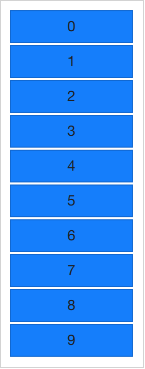
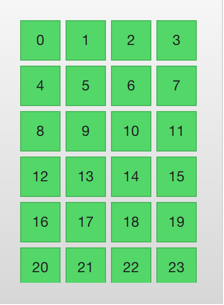
In der einfachsten Form wird der Repeater verwendet um eine Anzahl von Elementen zu erzeugen. Jedes Objekt hat dann Zugriff auf die definierten Eigenschaften und zusätzlich auf die Variable index um die Elemente von einander zu trennen. Im untenstehenden Beispiel werden 10 Instanzen eines Objekts “BlueBox” erzeugt. (“BlueBox” ist dabei der Delegat, siehe unten). Die Anzahl wird von der Eigenschaft model gesteuert. Für jedes “BlueBox”-Objekt wird das darin definierte Text-Element erstellt, dessen Wert auf die Variable index gesetzt wird. So können die durchnummerierten Elemente unterschieden werden.
import QtQuick 2.5
import "../common"

Column {
    spacing: 2

    Repeater {
        model: 10
        BlueBox {
            width: 120
            height: 32
            text: index
        }
    }
}
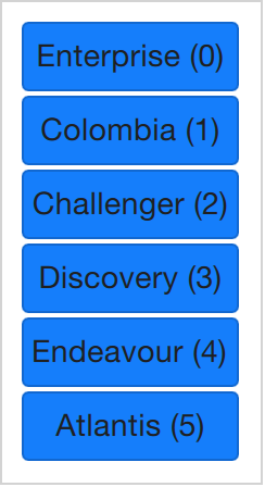
Nummerierte Elemente sind zwar schön, aber manchmal möchte man komplexere Daten darstellen. Statt einer einfachen Zahl, füttern wird model mit einem JavaScript Array. Der Inhalt eines Arrays kann alles mögliche sein: Zeichenketten, Zahlen oder Objekte. Im untenstehenden Beispiel wird eine Liste von Zeichenketten verwendet. Wir können die index-Variable weiterhin verwenden aber wir können jetzt auch auf einzelne Datenelemente zugreifen, indem wir auf die spezielle Eigenschaft modelData zugreifen, die dann den Wert des aktuellen Elements enthält.
import QtQuick 2.5
import "../common"

Column {
    spacing: 2

    Repeater {
        model: ["Enterprise", "Columbia", "Challenger", "Discovery", "Endeavour", "Atlantis"]

        BlueBox {
            width: 100
            height: 32
            radius: 3

            text: modelData + ' (' + index + ')'
        }
    }
}
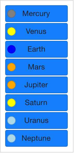
Weil man jetzt Daten eines Array darstellen kann, will man auch mehrere Daten pro Array-Element darstellen können. Dafür braucht man jetzt bessere Modelle. Eines der trivialsten Modelle aber auch eines der weit verbreitetsten ist das ListModel. Ein ListModel ist eine Zusammenstellung von ListElement Elementen. Innerhalb jedes solchen Listenelements kann es mehrere Eigenschaften mit Werten geben. Im folgenden Beispiel ein Name und eine Farbe für jedes Element.
Die Eigenschaft (z.B. Farbe) in jedem Element wird von der Ansicht “Repeater” dann dem jeweiligen Objekt (hier: BlueBox) zugeordnet, d.h. die Variablen name und surfaceColor sind dann im Objekt Rectangle und Text erreichbar und werden als Werte verwendet. Man kommt so nicht nur einfach an die Daten, es macht den Quellcode auch einfach lesbarer. surfaceColor ist jetzt die Farbe des kleinen Kreises links neben dem Namen und nicht so etwas Seltsames wie data[i][j].
import QtQuick 2.5
import "../common"

Column {
    spacing: 2

    Repeater {
        model: ListModel {
            ListElement { name: "Mercury"; surfaceColor: "gray" }
            ListElement { name: "Venus"; surfaceColor: "yellow" }
            ListElement { name: "Earth"; surfaceColor: "blue" }
            ListElement { name: "Mars"; surfaceColor: "orange" }
            ListElement { name: "Jupiter"; surfaceColor: "orange" }
            ListElement { name: "Saturn"; surfaceColor: "yellow" }
            ListElement { name: "Uranus"; surfaceColor: "lightBlue" }
            ListElement { name: "Neptune"; surfaceColor: "lightBlue" }
        }

        BlueBox {
            width: 120
            height: 32

            radius: 3
            text: name

            Box {
                anchors.left: parent.left
                anchors.verticalCenter: parent.verticalCenter
                anchors.leftMargin: 4

                width: 16
                height: 16

                radius: 8

                color: surfaceColor
            }
        }
    }
}
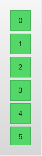
Die letztendliche Darstellung, welche in einer “Repeater”-Ansicht für jedes Datenobjekt erzeugt wird, nennt man Delegat und wird mit der Eigenschaft delegate ausgezeichnet. Bisher wurde dieses Schlüsselwort nur nicht verwendet. Das heißt, der Beispielcode Example 01 ist gleichbedeutend zum folgenden Code. Der Unterschied ist, dass der Delegat jetzt explizit benannt wurde.
import QtQuick 2.5
import "../common"

Column {
    spacing: 2

    Repeater {
        model: 10

        delegate: BlueBox {
            width: 100
            height: 32
            text: index
        }
    }
}
Dynamische Ansichten
Repeater funktionieren zwar gut für begrenzte, nicht veränderbare Datensätze aber im wirklichen Leben sind Modelle eher komplexer und größer. Es werden bessere Lösungen gebraucht. Qt Quick stellt die Elemente ListView und GridView bereit. Diese sind von einer Flickable-Fläche abgeleitet, so dass sich der Benutzer in Darstellungen großer Datensätze bewegen kann. Gleichzeitig begrenzen sie die Anzahl gleichzeitig dargestellter Delegaten und das bedeutet dass nur die wenigen wirklich sichtbaren Elemente aus einem großen Datensatz dargestellt werden.
Beide Elemente sind sehr ähnlich in der Benutzung. Wir beginnen mit dem ListView und beschreiben dann den GridView um sie beide zu vergleichen.
Die Ansicht ListView ist dem Repeater Element sehr ähnlich. Es verwendet ein model und instantiiert einen Delegaten delegate und zwischen den Delegaten kann es spacing geben. Der folgende Code zeigt ein einfaches Setup.
import QtQuick 2.5
import "../common"

Background {
    width: 80
    height: 300

    ListView {
        anchors.fill: parent
        anchors.margins: 20

        clip: true

        model: 100

        delegate: numberDelegate
        spacing: 5
    }

    Component {
        id: numberDelegate

        GreenBox {
            width: 40
            height: 40
            text: index
        }
    }
}
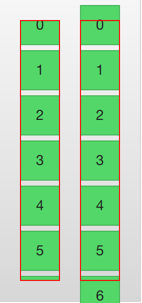
Wenn das Modell mehr Daten enthält als auf den Bildschirm passt, zeigt ListView nur einen Teil der Daten. Das Standardverhalten von Qt Quick beschränkt die Anzeige eines ListView allerdings nicht auf die Bildschirmfläche in der die Delegatenansichten gezeigt werden. Die Delegaten können ausserhalb der ListView sichtbar sein und immer wenn das Programm dynamisch Delegaten hinzufügt oder löscht, könnten diese für den Benutzer sichtbar sein. Um das zu verhindern muss das Abschneiden (“clipping”) für das Listview-Element aktiviert werden. Die folgende Illustration zeigt das Ergebnis von clipping (links) im Vergleich zu ohne clipping (rechts).
Für den Benutzer ist die Ansicht ListView eine scrollbare Fläche. Es unterstützt kinetisches Scrollen, d.h. man kann sehr schnell durch den Inhalt wischen. Standardmäßig kann es auch über das Ende und den Anfang hinaus gezogen werden, worauf es zurückfedert um dem Benutzer zu zeigen, dass Anfang oder Ende erreicht wurden.
Das Verhalten am Ende der Ansicht wird über die Eigenschaft boundsBehavior gesteuert. Diese Eigenschaft kann zählbare Werte enthalten, standardmäßig bedeutet Flickable.DragAndOvershootBounds dass die Ansicht sowohl über seine Grenzen gezogen als auch gewischt werden kann. Mit Flickable.StopAtBounds wird die Ansicht nie über die Grenze gehen und mit Flickable.DragOverBounds kann der Benutzer durch Ziehen über die Grenze treten, nicht allerdings durch schnelles Wischen.
Man kann die Positionen an denen die Ansicht gestoppt wird einschränken: mit hilfe der Eigenschaft snapMode. Standardmäßig bedeutet ListView.NoSnap dass die Ansicht an jeder Position anhalten kann. Setzt man sie auf ListView.SnapToItem wird die Ansicht immer oben am oberen Rand eines Elements ausgerichtet. Schließlich wird bei ListView.SnapOneItem die Ansicht immer nur höchstens ein Element vom ersten sichtbaren Element anhalten, sobald die Maus oder ein touch losgelassen wird. Der letzte Modus ist nützlich beim Blättern durch Seiten.
Hoch- oder Querformat
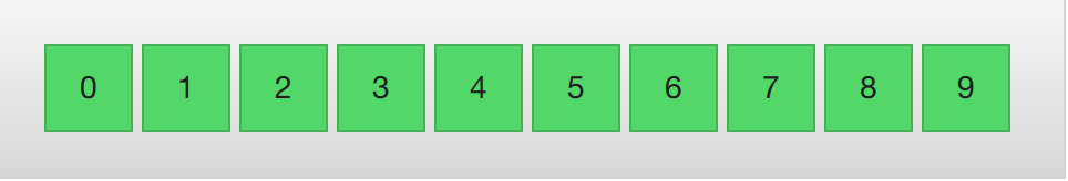
Die ListView-Ansicht erlaubt neben vertikaler Anzeige und Scrollen auch horizontales Scrollen, welches genauso nützlich sein kann. Die Ausrichtung der ListView-Ansicht wird von der Eigenschaft orientation gesteuert. Es kann entweder den Standardwert ListView.Vertical oder den Wert ListView.Horizontal bekommen. Im folgenden sieht man letzteres.
import QtQuick 2.5
import "../common"

Background {
    width: 480
    height: 80

    ListView {
        anchors.fill: parent
        anchors.margins: 20
        spacing: 4
        clip: true
        model: 100
        orientation: ListView.Horizontal
        delegate: numberDelegate
    }

    Component {
        id: numberDelegate

        GreenBox {
            width: 40
            height: 40
            text: index
        }
    }
}
Wie man sich vorstellen kann geht die Richtung der horizontalen Darstellung von links nach rechts. Über die Eigenschaft layoutDirection kann man mit Qt.LeftToRight oder mit Qt.RightToLeft die Darstellungsrichtung beeinflussen.
Tastennavigation und Highlighting
Wenn man eine ListView-Ansicht mit einem touch-fähigen Gerät verwendet, reicht die Darstellung aus. Wenn man aber mit einer Tastatur oder sogar nur mit Pfeiltasten ein Element auswählen soll, braucht man ein Verfahren um das momentan ausgewählte Element hervorzuheben. In QML nennt man das “highlighting”.
Die Ansichten wie ListView in QML erlauben es eines der gezeigten Delegaten hervorheben zu können. Man kann es als zusätzlichen Delegaten ansehen, nur dass dieser eben nur einmal erzeugt wird und an der Stelle des momentanen Elements angezeigt wird.
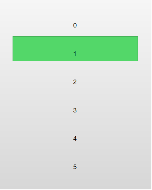
Im folgenden Beispiel wird das demonstriert. Man muss zwei Attribute dafür verwenden. Erstens, die focus-Eigenschaft muss auf true gesetzt werden, so bekommt die Tastatur von der ListView-Ansicht den Fokus. Zweitens muss die highlight-Eigenschaft auf den hervorzuhebenden Delegaten gesetzt sein. Der hervorgehobene Delegat bekommt die x, y und die height-Werte des aktuellen Elements. Wenn der width-Wert nicht angegeben wird, dann wird auch die Breite des aktuellen Elements verwendet.
Im Beispiel wird die angebundene Eigenschaft ListView.view.width für die Breite verwendet. Gebundene Eigenschaften, die für Delegaten verfügbar sind werden im Abschnitt zu Delegaten dieses Kapitels diskutiert, aber es ist schon jetzt gut zu wissen, dass die gleichen Eigenschaften auch hervorgehobenen Delegaten zur Verfügung stehen.
import QtQuick 2.5
import "../common"

Background {
    width: 240
    height: 300

    ListView {
        id: view
        anchors.fill: parent
        anchors.margins: 20

        clip: true

        model: 100

        delegate: numberDelegate
        spacing: 5

        highlight: highlightComponent
        focus: true
    }

    Component {
        id: highlightComponent

        GreenBox {
            width: ListView.view.width
        }
    }

    Component {
        id: numberDelegate

        Item {
            width: ListView.view.width
            height: 40

            Text {
                anchors.centerIn: parent

                font.pixelSize: 10

                text: index
            }
        }
    }
}
When using a highlight in conjunction with a ListView, a number of properties can be used to control its behavior. The highlightRangeMode controls how the highlight is affected by what is shown in the view. The default setting, ListView.NoHighlightRange means that the highlight and the visible range of items in the view not are related at all.
The value ListView.StrictlyEnforceRange ensures that the highlight is always visible. If an action attempts to move the highlight outside the visible part of the view, the current item will change accordingly, so that the highlight remains visible.
The middle ground is the ListView.ApplyRange value. It attempts to keep the highlight visible, but does not alter the current item to enforce this. Instead, the highlight is allowed to move out of view if necessary.
In the default configuration, the view is responsible for moving the highlight into position. The speed of the movement and resizing can be controlled, either as a speed or as a duration. The properties involved are highlightMoveSpeed, highlightMoveDuration, highlightResizeSpeed and highlightResizeDuration. By default, the speed is set to 400 pixels per second, and the duration is set to -1, indicating that the speed and distance control the duration. If both a speed and a duration is set, the one that results in the quickest animation is chosen.
To control the movement of the highlight more in detail, the highlightFollowCurrentItem property can be set to false. This means that the view is no longer responsible for the movement of the highlight delegate. Instead, the movement can be controlled through a Behavior or an animation.
In the example below, the y property of the highlight delegate is bound to the ListView.view.currentItem.y attached property. This ensures that the highlight follows the current item. However, as we do not let the view move the highlight, we can control how the element is moved. This is done through the Behavior on y. In the example below, the movement is divided into three steps: fading out, moving, before fading in. Notice how SequentialAnimation and PropertyAnimation elements can be used in combination with the NumberAnimation to create a more complex movement.
    Component {
        id: highlightComponent

        Item {
            width: ListView.view.width
            height: ListView.view.currentItem.height

            y: ListView.view.currentItem.y

            Behavior on y {
                SequentialAnimation {
                    PropertyAnimation { target: highlightRectangle; property: "opacity"; to: 0; duration: 200 }
                    NumberAnimation { duration: 1 }
                    PropertyAnimation { target: highlightRectangle; property: "opacity"; to: 1; duration: 200 }
                }
            }

            GreenBox {
                id: highlightRectangle
                anchors.fill: parent
            }
        }
    }
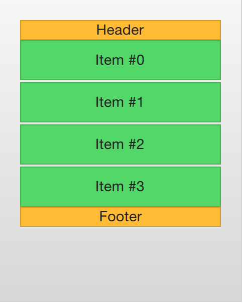
Header and Footer
At the end of the ListView contents, a header and a footer element can be inserted. These can be considered special delegates places at the beginning or end of the list. For a horizontal list, these will not appear at the head or foot, but rather at then beginning or end, depending on the layoutDirection used.
The example below illustrates how an header and footer can be used to enhance the perception of the beginning and end of a list. There are other uses for these special list elements. For instance, they can be used to keep buttons to load more contents.
import QtQuick 2.5
import "../common"

Background {
    width: 240
    height: 300

    ListView {
        anchors.fill: parent
        anchors.margins: 20

        clip: true

        model: 4

        delegate: numberDelegate
        spacing: 2

        header: headerComponent
        footer: footerComponent
    }

    Component {
        id: headerComponent

        YellowBox {
            width: ListView.view.width
            height: 20
            text: 'Header'

        }
    }

    Component {
        id: footerComponent

        YellowBox {
            width: ListView.view.width
            height: 20
            text: 'Footer'
        }
    }

    Component {
        id: numberDelegate

        GreenBox {
            width: ListView.view.width
            height: 40
            text: 'Item #' + index
        }
    }
}
Bemerkung
Header and footer delegates do not respect the spacing property of a ListView, instead they are placed directly adjacent to the next item delegate in the list. This means that any spacing must be a part of the header and footer items.
The GridView
Using a GridView is very similar to using a ListView. The only real difference is that the grid view places the delegates in a two dimensional grid instead of in a linear list.
Compared to a list view, the grid view does not rely on spacing and the size of its delegates. Instead, it uses the cellWidth and cellHeight properties to control the dimensions of the contents delegates. Each delegate item is then places in the top left corner of each such cell.
import QtQuick 2.5
import "../common"

Background {
    width: 220
    height: 300

    GridView {
        id: view
        anchors.fill: parent
        anchors.margins: 20

        clip: true

        model: 100

        cellWidth: 45
        cellHeight: 45

        delegate: numberDelegate
    }

    Component {
        id: numberDelegate

        GreenBox {
            width: 40
            height: 40
            text: index
        }
    }
}
A GridView contains headers and footers, can use a highlight delegate and supports snap modes as well as various bounds behaviors. It can also be orientated in different directions and orientations.
The orientation is controlled using the flow property. It can be set to either GridView.LeftToRight or GridView.TopToBottom. The former value fills a grid from the left to the right, adding rows from the top to the bottom. The view is scrollable in the vertical direction. The latter value adds items from the top to the bottom, filling the view from left to right. The scrolling direction is horizontal in this case.
In addition to the flow property, the layoutDirection property can adapt the direction of the grid to left-to-right or right-to-left languages, depending on the value used.
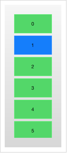
Der Delegat
Wenn man Modelle und Ansichten in einem eigenen Userinterface verwendet, spielt der Delegat eine große Rolle für das Erscheinungsbild. Jedes Teil in einem Modell wird nämlich über einen Delegaten visualisiert, was also am Ende beim Benutzer sichtbar wird, sind die Delegaten.
Jeder Delegat bekommt Zugriff auf eine Reihe von zugeordneten Eigenschaften, einige vom Datenmodell, andere von der Ansicht. Vom Modell bekommt der Delegat die Daten für jeden Datenpunkt in einer Eigenschaft. Von der Ansicht bekommt der Delegat wichtige Informationen zum Zustand innerhalb der Ansicht.
Die am meisten genutzte Eigenschaft aus der Ansicht ist ListView.isCurrentItem und ListView.view. Die erste ist ein Bool’scher Wert, der anzeigt ob das Element aktuelle Element ist, während die zweite nur eine lesbare Referenz auf die Ansicht selbst ist. Über den Zugriff auf die Ansicht ist es mögliche generische, wiederverwendbare Delegaten zu erzeugen, die sich an die Größe und Art der Ansicht anpassen in der sie sich befinden. Im Beispiel unten ist die width jedes Delegaten begrenzt durch die Breite der Ansicht, während die Hintergrundfarbe color jedes Delegaten von der zugehörigen Eigenschaft ListView.isCurrentItem abhängt.
import QtQuick 2.5

Rectangle {
    width: 120
    height: 300

    gradient: Gradient {
        GradientStop { position: 0.0; color: "#f6f6f6" }
        GradientStop { position: 1.0; color: "#d7d7d7" }
    }

    ListView {
        anchors.fill: parent
        anchors.margins: 20

        clip: true

        model: 100

        delegate: numberDelegate
        spacing: 5

        focus: true
    }

    Component {
        id: numberDelegate

        Rectangle {
            width: ListView.view.width
            height: 40

            color: ListView.isCurrentItem?"#157efb":"#53d769"
            border.color: Qt.lighter(color, 1.1)

            Text {
                anchors.centerIn: parent

                font.pixelSize: 10

                text: index
            }
        }
    }
}
Wenn jeder Datenpunkt in einem Modell mit einer Aktion verknüpft ist, z.B. das Klicken auf ein Teil löst eine Aktion aus, dann wird diese Funktionalität jedem Delegaten übertragen. Das teilt somit das Event-Management zwischen Ansicht, die die Navigation zwischen den Daten und dem Delegaten auf, der die Reaktion auf spezielle Elemente verarbeitet.
Der einfachste Weg das zu erreichen ist eine MouseArea innerhalb jedes Delegaten zu erzeugen und auf das onClicked-Signal zu reagieren. Das wird im Beispiel des nächsten Abschnitts dieses Kapitels demonstriert.
Animating Added and Removed Items
In some cases, the contents shown in a view changes over time. Items are added and removed as the underlaying data model is altered. In these cases, it is often a good idea to employ visual ques to give the user a sense of direction and to help the user understand what data is added or removed.
Conveniently enough, QML views attaches two signals, onAdd and onRemove, to each item delegate. By connecting animations to these, it is easy to create the movement necessary to aid the user in identifying what is taking place.
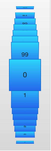
The example below demonstrates this through the use of a dynamically populated ListModel. At the bottom of the screen, a button for adding new items is shown. When it is clicked, a new item is added to the model using the append method. This triggers the creation of a new delegate in the view, and the emission of the GridView.onAdd signal. The SequentialAnimation attached to the signal causes the item to zoom into view by animating the scale property of the delegate.
When a delegate in the view is clicked, the item is removed from the model through a call to the remove method. This causes the GridView.onRemove signal to be emitted, triggering another SequentialAnimation. This time, however, the destruction of the delegate must be delayed until the animation has completed. To do this, PropertyAction element are used to set the GridView.delayRemove property to true before the animation, and false after. This ensures that the animation is allowed to complete before the delegate item is removed.
import QtQuick 2.5

Rectangle {
    width: 480
    height: 300

    gradient: Gradient {
        GradientStop { position: 0.0; color: "#dbddde" }
        GradientStop { position: 1.0; color: "#5fc9f8" }
    }

    ListModel {
        id: theModel

        ListElement { number: 0 }
        ListElement { number: 1 }
        ListElement { number: 2 }
        ListElement { number: 3 }
        ListElement { number: 4 }
        ListElement { number: 5 }
        ListElement { number: 6 }
        ListElement { number: 7 }
        ListElement { number: 8 }
        ListElement { number: 9 }
    }

    Rectangle {
        anchors.left: parent.left
        anchors.right: parent.right
        anchors.bottom: parent.bottom
        anchors.margins: 20

        height: 40

        color: "#53d769"
        border.color: Qt.lighter(color, 1.1)

        Text {
            anchors.centerIn: parent

            text: "Add item!"
        }

        MouseArea {
            anchors.fill: parent

            onClicked: {
                theModel.append({"number": ++parent.count});
            }
        }

        property int count: 9
    }

    GridView {
        anchors.fill: parent
        anchors.margins: 20
        anchors.bottomMargin: 80

        clip: true

        model: theModel

        cellWidth: 45
        cellHeight: 45

        delegate: numberDelegate
    }

    Component {
        id: numberDelegate

        Rectangle {
            id: wrapper

            width: 40
            height: 40

            gradient: Gradient {
                GradientStop { position: 0.0; color: "#f8306a" }
                GradientStop { position: 1.0; color: "#fb5b40" }
            }

            Text {
                anchors.centerIn: parent

                font.pixelSize: 10

                text: number
            }

            MouseArea {
                anchors.fill: parent

                onClicked: {
                    theModel.remove(index);
                }
            }

            GridView.onRemove: SequentialAnimation {
                PropertyAction { target: wrapper; property: "GridView.delayRemove"; value: true }
                NumberAnimation { target: wrapper; property: "scale"; to: 0; duration: 250; easing.type: Easing.InOutQuad }
                PropertyAction { target: wrapper; property: "GridView.delayRemove"; value: false }
            }

            GridView.onAdd: SequentialAnimation {
                NumberAnimation { target: wrapper; property: "scale"; from: 0; to: 1; duration: 250; easing.type: Easing.InOutQuad }
            }
        }
    }
}
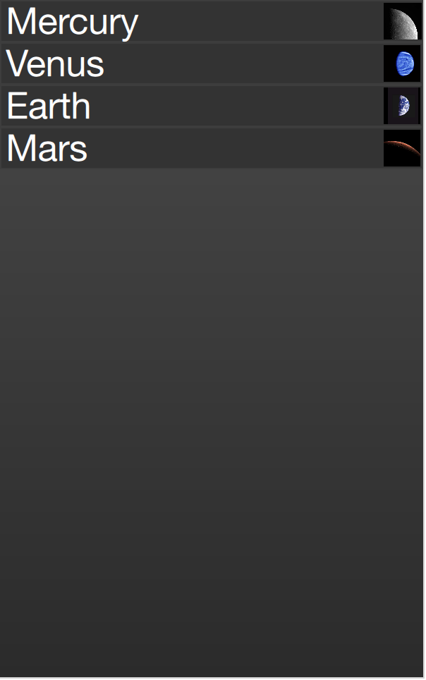
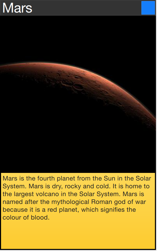
Shape-Shifting Delegates
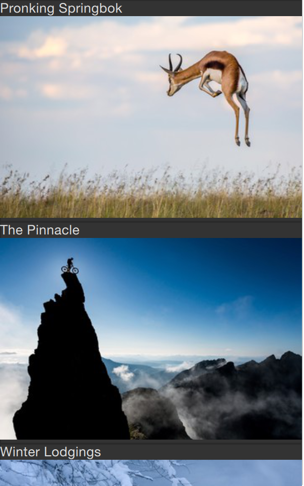
A commonly used mechanism in lists is that the current item is expanded when activated. This can be used to dynamically let the item expand to fill the screen to enter a new part of the user interface, or it can be used to provide slightly more information for the current item in a given list.
In the example below, each item is expanded to the full extent of the ListView containing it when clicked. The extra spaced is then used to add more information. The mechanism used to control this is a state, expanded that each item delegate can enter, where the item is expanded. In that state, a number of properties are altered.
First of all, the height of the wrapper is set to the height of the ListView. The thumbnail image is then enlarged and moved down to make it move from its small position into its larger position. In addition to this, the two hidden items, the factsView and closeButton are shown by altering the opacity of the elements. Finally, the ListView is setup.
Setting up the ListView involves setting the contentsY, that is the top of the visible part of the view, to the y value of the delegate. The other change is to set interactive of the view to false. This prevents the view from moving. The user can no longer scroll through the list or change the current item.
As the item first is clicked, it enters the expanded state, causing the item delegate to fill the ListView and the contents to rearrange. When the close button is clicked, the state is cleared, causing the delegate to return to its previous state and re-enabling the ListView.
import QtQuick 2.5

Item {
    width: 300
    height: 480

    Rectangle {
        anchors.fill: parent
        gradient: Gradient {
            GradientStop { position: 0.0; color: "#4a4a4a" }
            GradientStop { position: 1.0; color: "#2b2b2b" }
        }
    }

    ListView {
        id: listView

        anchors.fill: parent

        delegate: detailsDelegate
        model: planets
    }

    ListModel {
        id: planets

        ListElement { name: "Mercury"; imageSource: "images/mercury.jpeg"; facts: "Mercury is the smallest planet in the Solar System. It is the closest planet to the sun. It makes one trip around the Sun once every 87.969 days." }
        ListElement { name: "Venus"; imageSource: "images/venus.jpeg"; facts: "Venus is the second planet from the Sun. It is a terrestrial planet because it has a solid, rocky surface. The other terrestrial planets are Mercury, Earth and Mars. Astronomers have known Venus for thousands of years." }
        ListElement { name: "Earth"; imageSource: "images/earth.jpeg"; facts: "The Earth is the third planet from the Sun. It is one of the four terrestrial planets in our Solar System. This means most of its mass is solid. The other three are Mercury, Venus and Mars. The Earth is also called the Blue Planet, 'Planet Earth', and 'Terra'." }
        ListElement { name: "Mars"; imageSource: "images/mars.jpeg"; facts: "Mars is the fourth planet from the Sun in the Solar System. Mars is dry, rocky and cold. It is home to the largest volcano in the Solar System. Mars is named after the mythological Roman god of war because it is a red planet, which signifies the colour of blood." }
    }

    Component {
        id: detailsDelegate

        Item {
            id: wrapper

            width: listView.width
            height: 30

            Rectangle {
                anchors.left: parent.left
                anchors.right: parent.right
                anchors.top: parent.top

                height: 30

                color: "#333"
                border.color: Qt.lighter(color, 1.2)
                Text {
                    anchors.left: parent.left
                    anchors.verticalCenter: parent.verticalCenter
                    anchors.leftMargin: 4

                    font.pixelSize: parent.height-4
                    color: '#fff'

                    text: name
                }
            }


            Rectangle {
                id: image

                width: 26
                height: 26

                anchors.right: parent.right
                anchors.top: parent.top
                anchors.rightMargin: 2
                anchors.topMargin: 2

                color: "black"


                Image {
                    anchors.fill: parent

                    fillMode: Image.PreserveAspectFit

                    source: imageSource
                }
            }

            MouseArea {
                anchors.fill: parent
                onClicked: parent.state = "expanded"
            }

            Item {
                id: factsView

                anchors.top: image.bottom
                anchors.left: parent.left
                anchors.right: parent.right
                anchors.bottom: parent.bottom

                opacity: 0

                Rectangle {
                    anchors.fill: parent

                    gradient: Gradient {
                        GradientStop { position: 0.0; color: "#fed958" }
                        GradientStop { position: 1.0; color: "#fecc2f" }
                    }
                    border.color: '#000000'
                    border.width: 2

                    Text {
                        anchors.fill: parent
                        anchors.margins: 5

                        clip: true
                        wrapMode: Text.WordWrap
                        color: '#1f1f21'

                        font.pixelSize: 12

                        text: facts
                    }
                }
            }

            Rectangle {
                id: closeButton

                anchors.right: parent.right
                anchors.top: parent.top
                anchors.rightMargin: 2
                anchors.topMargin: 2

                width: 26
                height: 26

                color: "#157efb"
                border.color: Qt.lighter(color, 1.1)

                opacity: 0

                MouseArea {
                    anchors.fill: parent
                    onClicked: wrapper.state = ""
                }
            }

            states: [
                State {
                    name: "expanded"

                    PropertyChanges { target: wrapper; height: listView.height }
                    PropertyChanges { target: image; width: listView.width; height: listView.width; anchors.rightMargin: 0; anchors.topMargin: 30 }
                    PropertyChanges { target: factsView; opacity: 1 }
                    PropertyChanges { target: closeButton; opacity: 1 }
                    PropertyChanges { target: wrapper.ListView.view; contentY: wrapper.y; interactive: false }
                }
            ]

            transitions: [
                Transition {
                    NumberAnimation {
                        duration: 200;
                        properties: "height,width,anchors.rightMargin,anchors.topMargin,opacity,contentY"
                    }
                }
            ]
        }
    }
}
The techniques demonstrated here to expand the delegate to fill the entire view can be employed to make an item delegate shift shape in a much smaller way. For instance, when browsing through a list of songs, the current item could be made slightly larger, accommodating more information about that particular item.
Advanced Techniques
The PathView
The PathView element is the most powerful, but also the most complex, view provided in Qt Quick. It makes it possible to create a view where the items are laid out along an arbitrary path. Along the same path, attributes such as scale, opacity and more can be controlled in detail.
When using the PathView, you have to define a delegate and a path. In addition to this, the PathView itself can be customized through a range of properties. The most common being pathItemCount, controlling the number of visible items at once, and the highlight range control properties preferredHighlightBegin, preferredHighlightEnd and highlightRangeMode, controlling where along the path the current item is to be shown.
Before looking at the highlight range control properties in depth, we must look at the path property. The path property expects a Path element defining the path that the delegates follows as the PathView is being scrolled. The path is defined using the startX and startY properties in combinations with path elements such as PathLine, PathQuad and PathCubic. These elements are joined together to form a two-dimensional path.
Zu tun
do we cover the line, quad and cubic through an illustration, or do we need a paragraph on them?
When the path has been defined, it is possible to further tune it using PathPercent and PathAttribute elements. These are placed in between path elements and provides a more fine grained control over the path and the delegates on it. The PathPercent controls how large a portion of the path that has been covered between each element. This, in turn, controls the distribution of delegates along the path, as they are distributed proportionally to the percentage progressed.
This is where the preferredHighlightBegin and preferredHighlightEnd properties of the PathView enters the picture. They both expect real values in the range between zero and one. The end is also expected to be more or equal to the beginning. Setting both these properties to, for instance, 0.5, the current item will be displayed at the location fifty percent along the path.
In the Path, the PathAttribute elements are placed between elements, just as PathPercent elements. They let you specify property values that are interpolated along the path. These properties are attached to the delegates and can be used to control any conceivable property.
The example below demonstrates how the PathView element is used to create view of cards that the user can flip through. It employs a number of tricks to do this. The path consists of three PathLine elements. Using PathPercent elements, the central element is properly centered and provided enough space not to be cluttered by other elements. Using PathAttribute elements, the rotation, size and z-value are controlled.
In addition to the path, the pathItemCount property of the PathView has been set. This controls how densely populated the path will be. The preferredHighlightBegin and preferredHighlightEnd the PathView.onPath is used to control the visibility of the delegates.
    PathView {
        anchors.fill: parent

        delegate: flipCardDelegate
        model: 100

        path: Path {
            startX: root.width/2
            startY: 0

            PathAttribute { name: "itemZ"; value: 0 }
            PathAttribute { name: "itemAngle"; value: -90.0; }
            PathAttribute { name: "itemScale"; value: 0.5; }
            PathLine { x: root.width/2; y: root.height*0.4; }
            PathPercent { value: 0.48; }
            PathLine { x: root.width/2; y: root.height*0.5; }
            PathAttribute { name: "itemAngle"; value: 0.0; }
            PathAttribute { name: "itemScale"; value: 1.0; }
            PathAttribute { name: "itemZ"; value: 100 }
            PathLine { x: root.width/2; y: root.height*0.6; }
            PathPercent { value: 0.52; }
            PathLine { x: root.width/2; y: root.height; }
            PathAttribute { name: "itemAngle"; value: 90.0; }
            PathAttribute { name: "itemScale"; value: 0.5; }
            PathAttribute { name: "itemZ"; value: 0 }
        }

        pathItemCount: 16

        preferredHighlightBegin: 0.5
        preferredHighlightEnd: 0.5
    }
The delegate, shown below, utilizes the attached properties itemZ, itemAngle and itemScale from the PathAttribute elements. It is worth noticing that the attached properties of the delegate only are available from the wrapper. Thus, the rotX property is defined to be able to access the value from within the Rotation element.
Another detail specific to PathView worth noticing is the usage of the attached PathView.onPath property. It is common practice to bind the visibility to this, as this allows the PathView to keep invisible elements for caching purposes. This can usually not be handled through clipping, as the item delegates of a PathView are placed more freely than the item delegates of ListView or GridView views.
    Component {
        id: flipCardDelegate

        BlueBox {
            id: wrapper

            width: 64
            height: 64
            antialiasing: true

            gradient: Gradient {
                GradientStop { position: 0.0; color: "#2ed5fa" }
                GradientStop { position: 1.0; color: "#2467ec" }
            }


            visible: PathView.onPath

            scale: PathView.itemScale
            z: PathView.itemZ

            property variant rotX: PathView.itemAngle
            transform: Rotation {
                axis { x: 1; y: 0; z: 0 }
                angle: wrapper.rotX;
                origin { x: 32; y: 32; }
            }
            text: index
        }
    }
When transforming images or other complex elements on in PathView, a performance optimization trick that is common to use is to bind the smooth property of the Image element to the attached property PathView.view.moving. This means that the images are less pretty while moving, but smoothly transformed when stationary. There is no point spending processing power on smooth scaling when the view is in motion, as the user will not be able to see this anyway.
A Model from XML
As XML is an ubiquitous data format, QML provides the XmlListModel element that exposes XML data as a model. The element can fetch XML data locally or remotely and then processes the data using XPath expressions.
The example below demonstrates fetching images from an RSS flow. The source property refers to a remove location over HTTP, and the data is automatically downloaded.
When the data has been downloaded, it is processed into model items and roles. The query property is an XPath representing the base query for creating model items. In this example, the path is /rss/channel/item, so for every item tag, inside a channel tag, inside an RSS tag, a model item is created.
For every model item, a number of roles are extracted. These are represented by XmlRole elements. Each role is given a name, which the delegate can access through an attached property. The actual value of each such property is determined through the XPath query for each role. For instance, the title property corresponds to the title/string() query, returning the contents between the <title> and </title> tags.
The imageSource property is more interesting as it not only extracts a string from the XML, but also processes it. In the stream provided, every item contains an image, represented by an <img src= tag. Using the substring-after and substring-before XPath functions, the location of the image is extracted and returned. Thus the imageSource property can be used directly as the source for an Image element.
import QtQuick 2.5
import QtQuick.XmlListModel 2.0
import "../common"

Background {
    width: 300
    height: 480

    Component {
        id: imageDelegate

        Box {
            width: listView.width
            height: 220
            color: '#333'

            Column {
                Text {
                    text: title
                    color: '#e0e0e0'
                }
                Image {
                    width: listView.width
                    height: 200
                    fillMode: Image.PreserveAspectCrop
                    source: imageSource
                }
            }
        }
    }

    XmlListModel {
        id: imageModel

        source: "http://feeds.nationalgeographic.com/ng/photography/photo-of-the-day/"
        query: "/rss/channel/item"

        XmlRole { name: "title"; query: "title/string()" }
        XmlRole { name: "imageSource"; query: "substring-before(substring-after(description/string(), 'img src=\"'), '\"')" }
    }

    ListView {
        id: listView
        anchors.fill: parent
        model: imageModel
        delegate: imageDelegate
    }
}
Lists with Sections
Sometimes, the data in a list can be divided into sections. It can be as simple as dividing a list of contacts into sections under each letter of the alphabet or music tracks under albums. Using a ListView it is possible to divide a flat list into categories, providing more depth to the experience.
In order to use sections, the section.property and section.criteria must be setup. The section.property defines which property to use to divide the contents into sections. Here, it is important to know that the model must be sorted so that each section consists of continuous elements, otherwise, the same property name might appear in multiple locations.
The section.criteria can be set to either ViewSection.FullString or ViewSection.FirstCharacter. The first is the default value and can be used for models that have clear sections, for example tracks of music albums. The latter takes the first character of a property and means that any property can be used for this. The most common example being the last name of contacts in a phone book.
When the sections have been defined, they can be accessed from each item using the attached properties ListView.section, ListView.previousSection and ListView.nextSection. Using these properties, it is possible to detect the first and last item of a section and act accordingly.
It is also possible to assign a section delegate component to the section.delegate property of a ListView. This creates a section header delegate which is inserted before any items of a section. The delegate component can access the name of the current section using the attached property section.
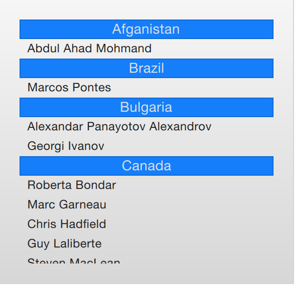
The example below demonstrates the section concept by showing a list of space men sectioned after their nationality. The nation is used as the section.property. The section.delegate component, sectionDelegate, shows a heading for each nation, displaying the name of the nation. In each section, the names of the space men are shown using the spaceManDelegate component.
import QtQuick 2.5
import "../common"

Background {
    width: 300
    height: 290

    ListView {
        anchors.fill: parent
        anchors.margins: 20

        clip: true

        model: spaceMen

        delegate: spaceManDelegate

        section.property: "nation"
        section.delegate: sectionDelegate
    }

    Component {
        id: spaceManDelegate

        Item {
            width: ListView.view.width
            height: 20
            Text {
                anchors.left: parent.left
                anchors.verticalCenter: parent.verticalCenter
                anchors.leftMargin: 8
                font.pixelSize: 12
                text: name
                color: '#1f1f1f'
            }
        }
    }

    Component {
        id: sectionDelegate

        BlueBox {
            width: ListView.view.width
            height: 20
            text: section
            fontColor: '#e0e0e0'
        }
    }


    ListModel {
        id: spaceMen

        ListElement { name: "Abdul Ahad Mohmand"; nation: "Afganistan"; }
        ListElement { name: "Marcos Pontes"; nation: "Brazil"; }
        ListElement { name: "Alexandar Panayotov Alexandrov"; nation: "Bulgaria"; }
        ListElement { name: "Georgi Ivanov"; nation: "Bulgaria"; }
        ListElement { name: "Roberta Bondar"; nation: "Canada"; }
        ListElement { name: "Marc Garneau"; nation: "Canada"; }
        ListElement { name: "Chris Hadfield"; nation: "Canada"; }
        ListElement { name: "Guy Laliberte"; nation: "Canada"; }
        ListElement { name: "Steven MacLean"; nation: "Canada"; }
        ListElement { name: "Julie Payette"; nation: "Canada"; }
        ListElement { name: "Robert Thirsk"; nation: "Canada"; }
        ListElement { name: "Bjarni Tryggvason"; nation: "Canada"; }
        ListElement { name: "Dafydd Williams"; nation: "Canada"; }
    }
}
Tuning Performance
The perceived performance of a view of a model depends very much on the time needed to prepare new delegates. For instance, when scrolling downwards through a ListView, delegates are added just outside the view on the bottom and are removed just as they leave sight over the top of the view. This becomes apparent if the clip property is set to false. If the delegates takes too much time to initialize, it will become apparent to the user as soon as the view is scrolled too quickly.
To work around this issue you can tune the margins, in pixels, on the sides of a scrolling view. This is done using the cacheBuffer property. In the case described above, vertical scrolling, it will control how many pixels above and below the ListView that will contain prepared delegates. Combining this with asynchronously loading Image elements can, for instance, give the images time to load before they are brought into view.
Having more delegates sacrifices memory for a smoother experience and slightly more time to initialize each delegate. This does not solve the problem of complex delegates. Each time a delegate is instantiated, its contents is evaluated and compiled. This takes time, and if it takes too much time, it will lead to a poor scrolling experience. Having many elements in a delegate will also degrade the scrolling performance. It simply costs cycles to move many elements.
To remedy the two later issues, it is recommended to use Loader elements. These can be used to instantiate additional elements when they are needed. For instance, an expanding delegate may use a Loader to postpone the instantiation of its detailed view until it is needed. For the same reason, it is good to keep the amount of JavaScript to a minimum in each delegate. It is better to let them call complex pieced of JavaScript that reside outside each delegate. This reduces the time spent compiling JavaScript each time a delegate is created.
Summary
In this chapter, we have looked at models, views and delegates. For each data entry in a model, a view instantiates a delegate visualizing the data. This separates the data from the presentation.
A model can be a single integer, where the index variable is provided to the delegate. If a JavaScript array is used as model, the modelData variable represents the data of the current index of the array, while index holds the index. For more complex cases, where multiple values needs to be provided by each data item, a ListModel populated with ListElement items is a better solution.
For static models, a Repeater can be used as the view. It is easy to combine it with a positioner such as Row, Column, Grid or Flow to build user interface parts. For dynamic or large data models, a view such as ListView or GridView are more appropriate. These create delegate instances on the fly as they are needed, reducing the number of elements live in the scene at once.
The delegates used in the views can be static items with properties bound to data from the model, or they can be dynamic, with states depending on if they are in focus or not. Using the onAdd and onRemove signals of the view, they can even be animated as they appear and disappear.